
In the realm of interior design, color is more than just a visual element; it's a powerful tool that can evoke emotions, influence moods, and shape perceptions. From the walls we paint to the frames we choose for our artwork, every color decision plays a crucial role in creating a harmonious and inviting space. In this blog post, we'll delve into the fascinating world of color psychology as it pertains to picture framing and room decor, uncovering the secrets behind why certain colors resonate with us on a subconscious level.
Understanding Color Psychology
Color is all around us, shaping our perceptions, influencing our emotions, and even guiding our decisions without us consciously realizing it. From the clothes we wear to the spaces we inhabit, color plays a pivotal role in our daily lives. But have you ever stopped to wonder why certain colors evoke specific feelings or associations? Welcome to the captivating world of color psychology, where hues speak a language all their own.
Harnessing the Power of Color Psychology
Understanding the psychological effects of color can empower us to make intentional choices when it comes to decorating our homes and selecting picture frames. But before getting to the effects different colors can have here are some important rules to keep in mind.
- Use color intentionally: Consider the emotional impact you want to achieve and choose colors accordingly. Whether you're painting a room, selecting clothing, or designing a marketing campaign, think about the message you want to convey and the feelings you want to evoke.
- Create balance: Balance is key when using color in design. Experiment with complementary colors, contrasts, and harmonious color schemes to create visual interest and cohesion.
- Pay attention to context: Be mindful of the cultural and situational context when interpreting the meaning of colors. What may be perceived positively in one culture or context may have a different connotation elsewhere.
The Role of Color in Picture Framing
When it comes to framing artwork or photographs, the color of the frame can significantly affect how the piece is perceived and the emotions it evokes. Here's a breakdown of some common frame colors and their psychological associations:
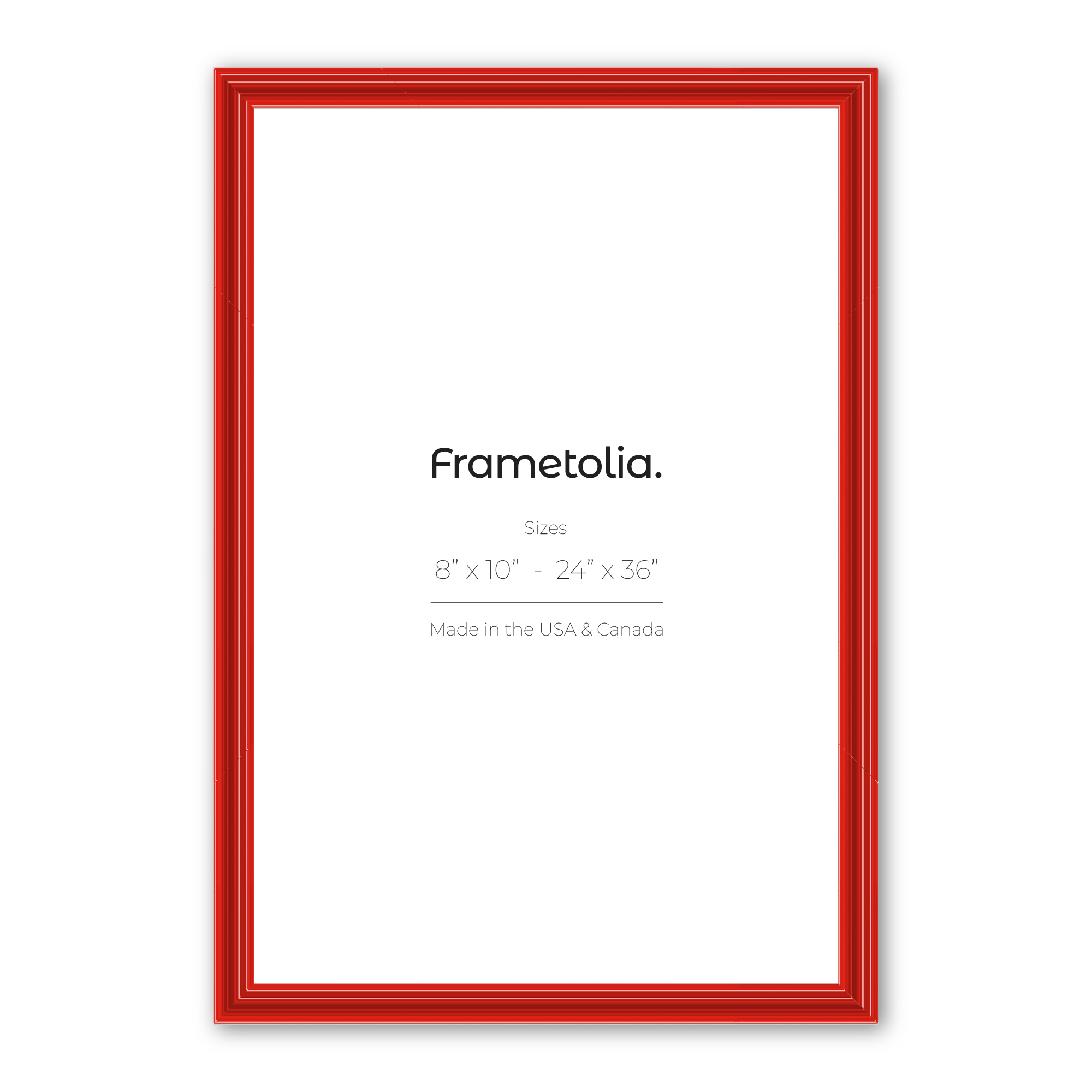
- Red: Bold, passionate, and attention-grabbing, red is often associated with energy, power, and intensity. It can evoke feelings of excitement, urgency, and even anger, making it a popular choice for brands seeking to make a statement.
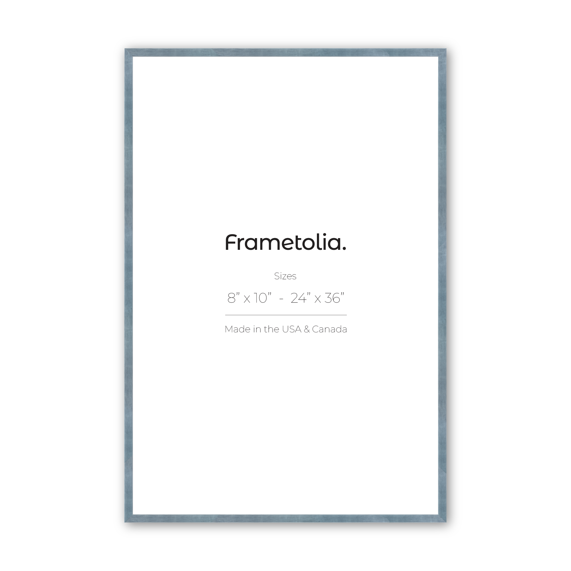
- Blue: Calm, serene, and soothing, blue has a tranquilizing effect on the mind and body. It's often associated with trust, stability, and reliability, making it a popular choice for corporate logos and healthcare settings.
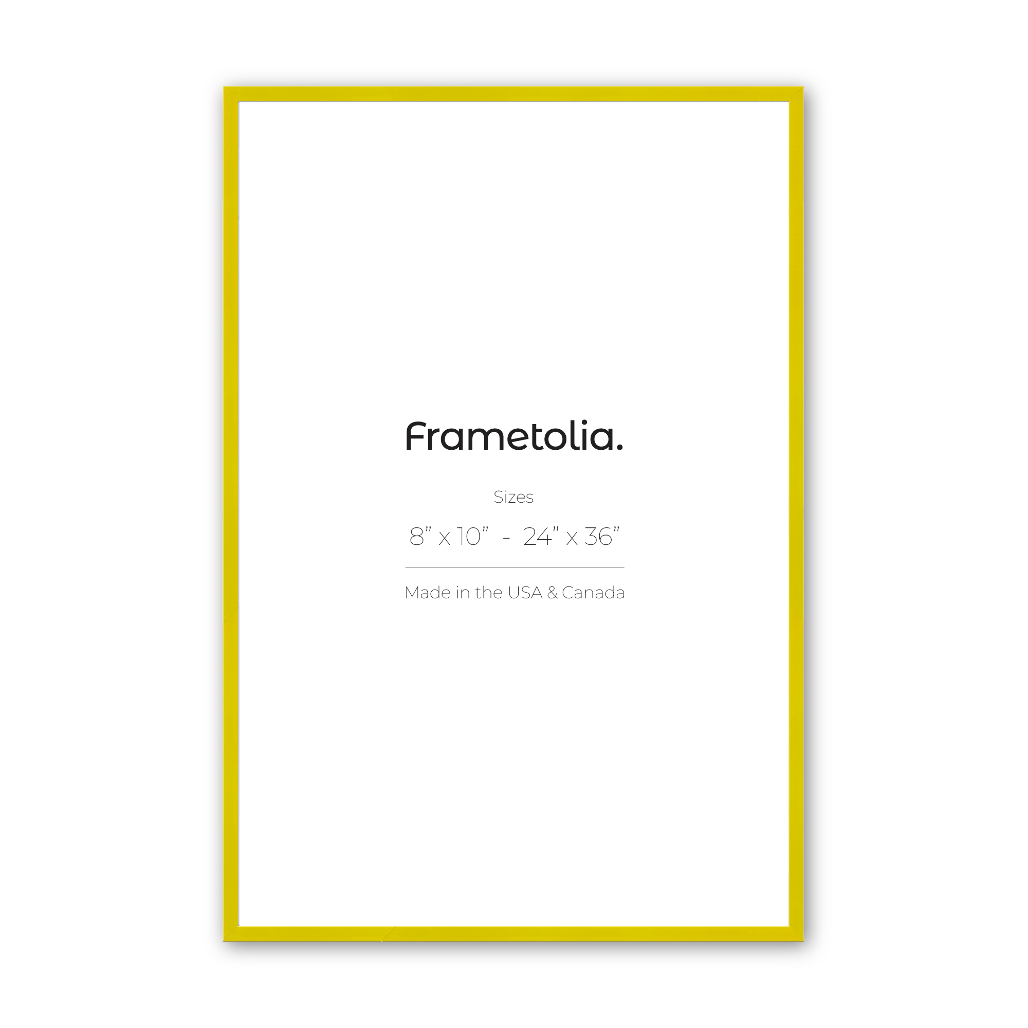
- Yellow: Bright, cheerful, and optimistic, yellow radiates warmth and positivity. It's often associated with joy, happiness, and creativity, making it a popular choice for promoting optimism and enthusiasm.
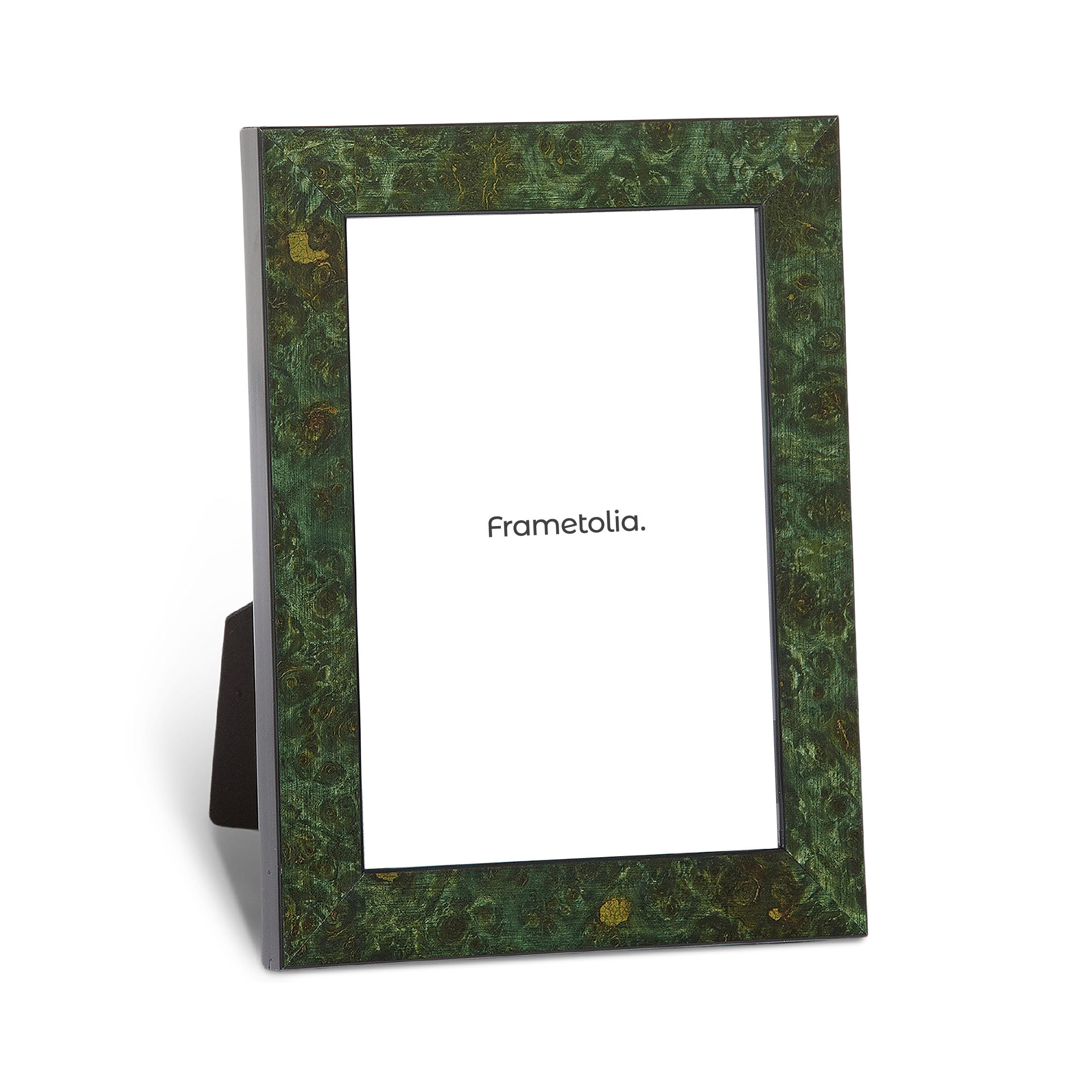
- Green: Fresh, rejuvenating, and harmonious, green is often associated with nature, growth, and balance. It has a calming effect on the mind and is often used to promote feelings of relaxation and renewal.
- Purple: Regal, mysterious, and introspective, purple has long been associated with royalty, spirituality, and creativity. It can evoke feelings of luxury, sophistication, and introspection.
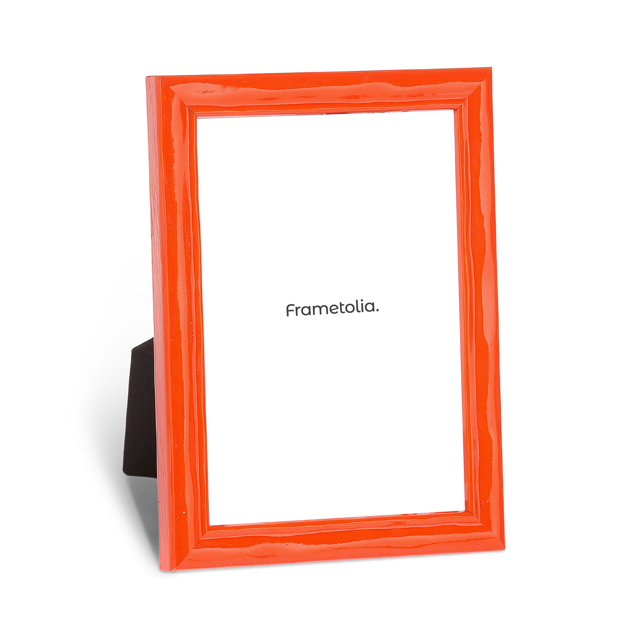
- Orange: Vibrant and energetic, orange combines the warmth of red with the brightness of yellow. It evokes feelings of enthusiasm, creativity, and warmth. Orange is often associated with vitality, excitement, and adventure.
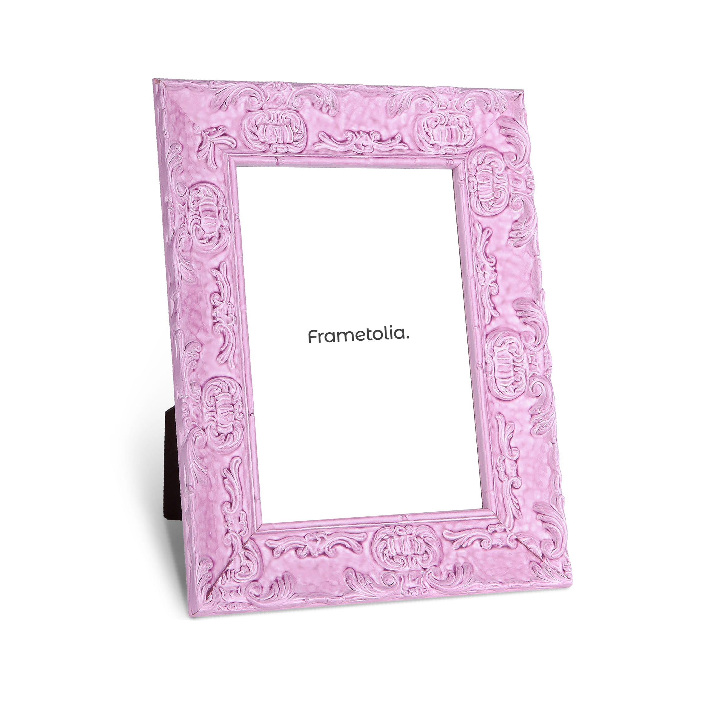
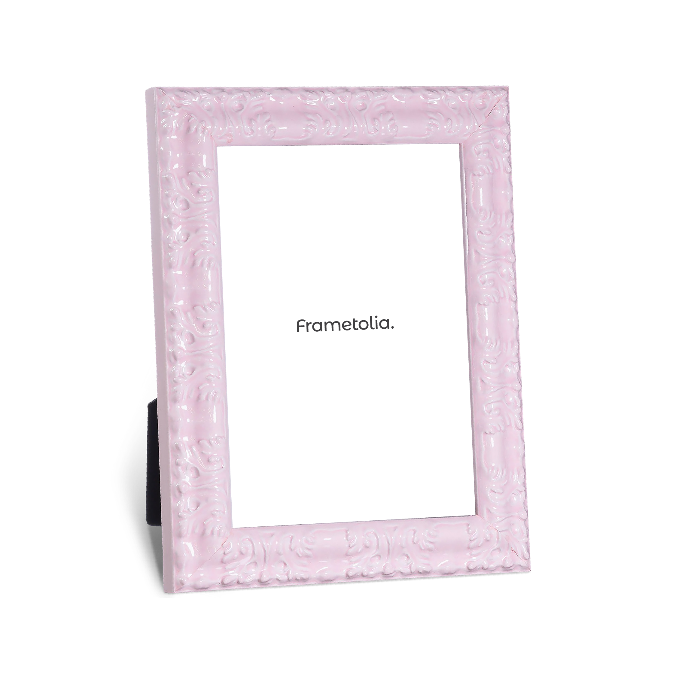
- Pink: Soft, delicate, and feminine, pink is often associated with romance, compassion, and sweetness. It can evoke feelings of tenderness, affection, and innocence. Lighter shades of pink are calming and nurturing, while brighter shades can be energizing and uplifting.
- Brown: Earthy and grounded, brown is often associated with stability, reliability, and simplicity. It evokes feelings of warmth, comfort, and security. Brown is commonly used in interior design to create a sense of coziness and connection to nature.
- Gray: Neutral and understated, gray is often associated with balance, sophistication, and practicality. It evokes feelings of calmness, elegance, and maturity. Gray can serve as a versatile backdrop, allowing other colors to stand out while maintaining a sense of harmony and balance.
- White: Pure and pristine, white is often associated with purity, cleanliness, and simplicity. It evokes feelings of clarity, innocence, and spaciousness. White can create a sense of openness and lightness in a space, making it feel airy and inviting.
- Black: Powerful and mysterious, black is often associated with strength, elegance, and sophistication. It evokes feelings of authority, formality, and intensity. Black can add drama and contrast to a space, creating a sense of depth and sophistication.
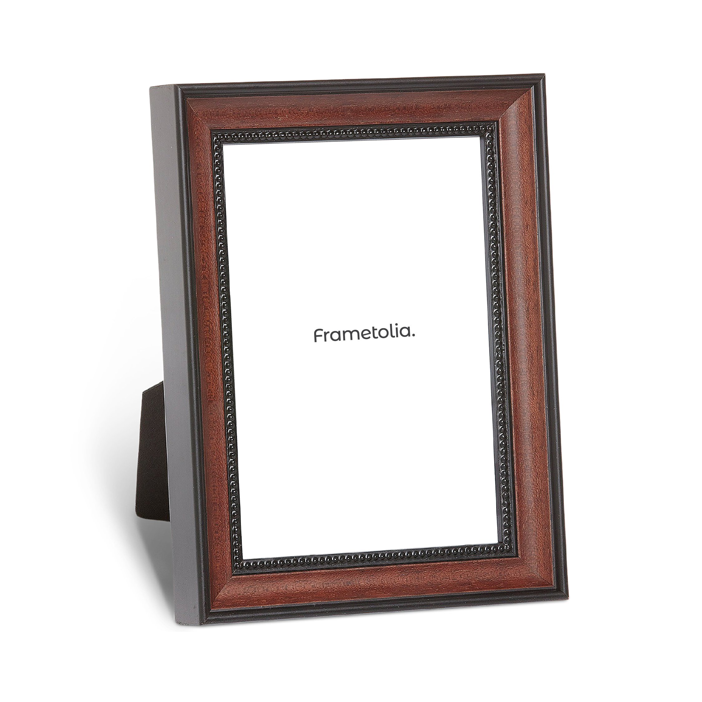
- Wood Tones: From warm oak to rich mahogany, wooden frames come in a variety of hues, each with its own unique character. Wood tones can evoke feelings of warmth, comfort, and connection to nature, making them a popular choice for creating cozy, inviting spaces.


Closing the Colorful Chapter
Each color has its own unique personality and can evoke a wide range of emotions and associations. By understanding the emotional spectrum of colors, we can use them strategically in design to create environments that evoke specific feelings and moods. Next time you ask yourself "what color picture frames should I get" we hope these helpful color psychology tips come to mind! You can find our collection of Frametolia colored frames here to get started on your colorful adventure.