
Misty Blues and Restful Greens
Misty blues and restful greens are emerging as one of the most influential color families for 2026. Their rise comes from a growing desire for interiors that feel serene, grounded, and tied to nature. These colors echo seafoam, fog, mineral stone, and eucalyptus which makes them a perfect fit for homeowners who want their spaces to feel peaceful without losing a sense of sophistication. The palette also pairs beautifully with natural textures like linen, rattan, and light wood which gives any room an effortless layered feel.
Why These Colors Are Trending
Designers are noticing a shift toward palettes that soothe the senses. After years of bold pigments and high contrast rooms, many people are craving colors that encourage rest and slow living. Misty blues and restful greens do this in a very inviting way. They soften sharper silhouettes, create gentle transitions between walls and furnishings, and bring a quiet elegance that works in both modern and traditional spaces. These tones also connect to mindful living which makes them well suited to bedrooms, entryways, and main living areas.
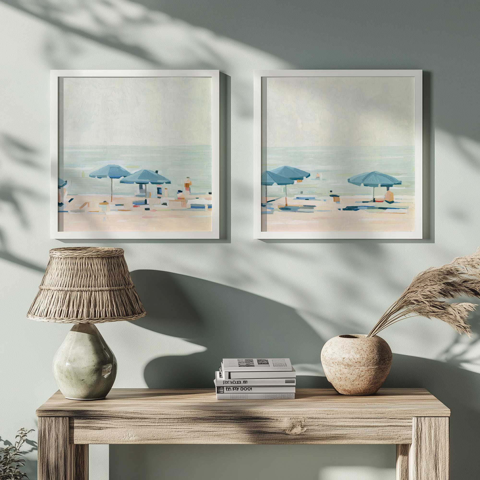
How to Use Misty Blues and Restful Greens in Wall Art
Art is one of the easiest ways to introduce this palette without committing to large surfaces. Look for pieces that echo the muted serenity of the trend and keep the room airy by mixing different values of the same hues. You can build a collected feel by combining a few styles within the same color story. Some of our top art styles for misty blues and restful greens are:
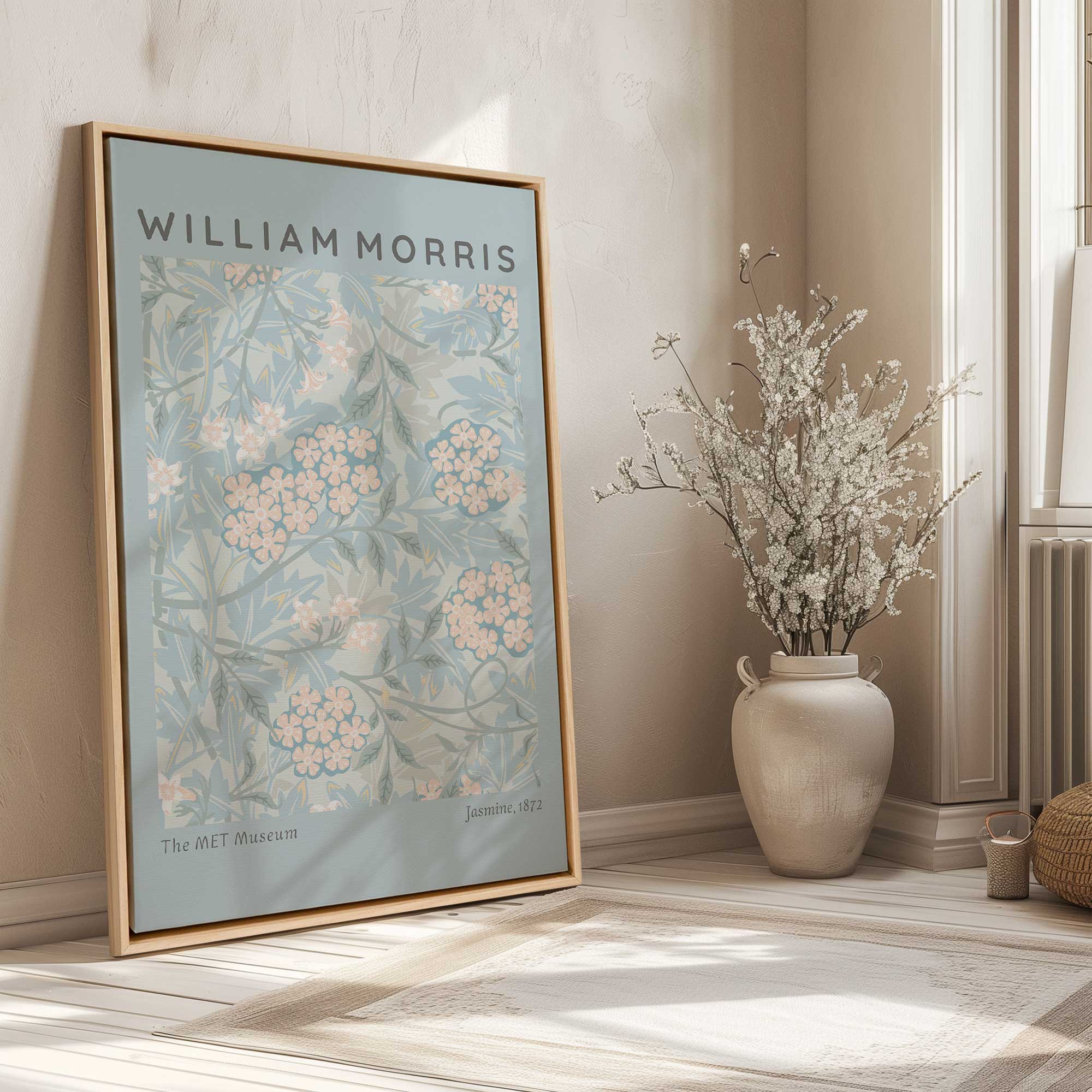
- Botanical studies in soft washed greens
- Abstract compositions in sea mineral tones
- Minimal linework with pale blue accents
- Coastal inspired art in sky colored gradients
- Vintage style prints with sage backgrounds
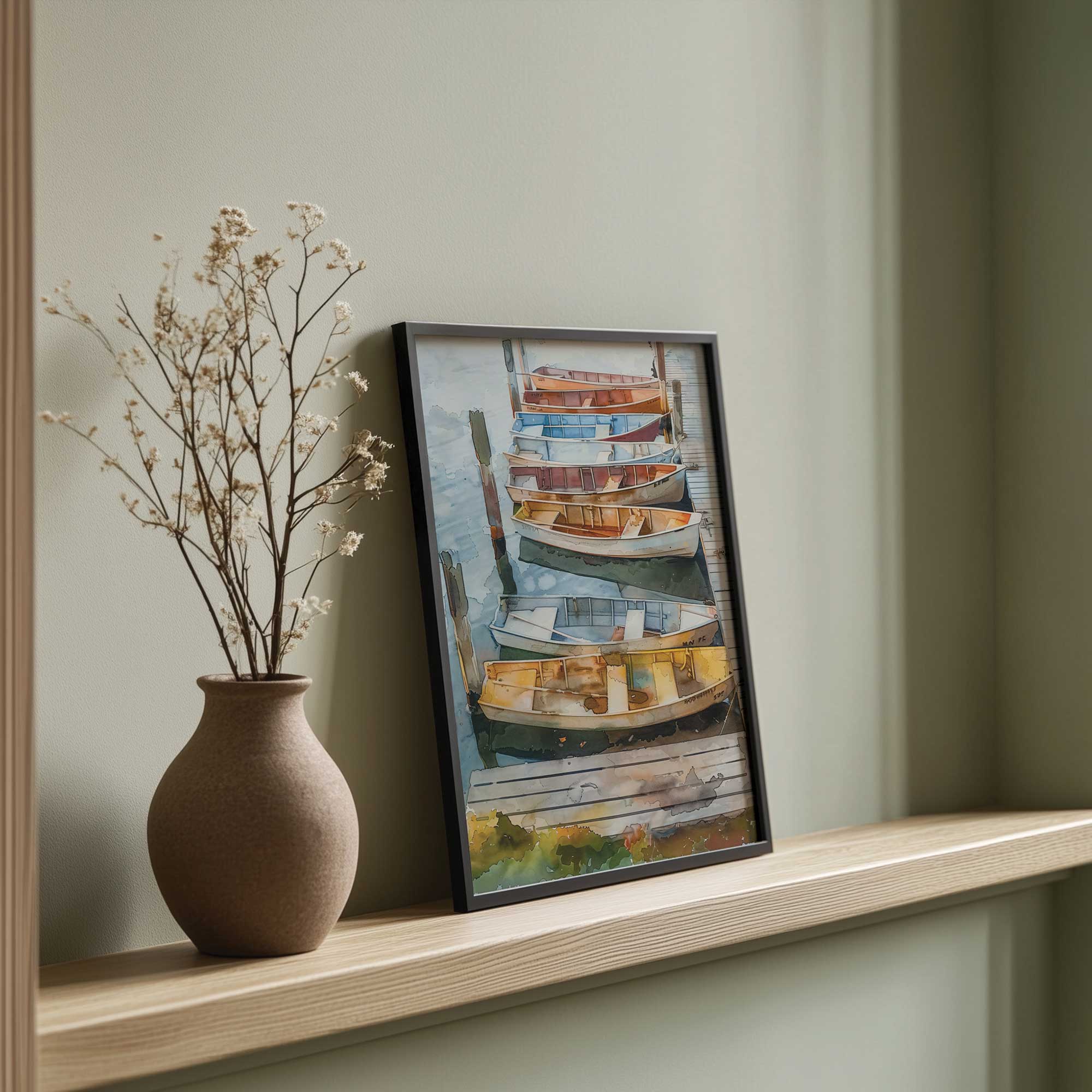
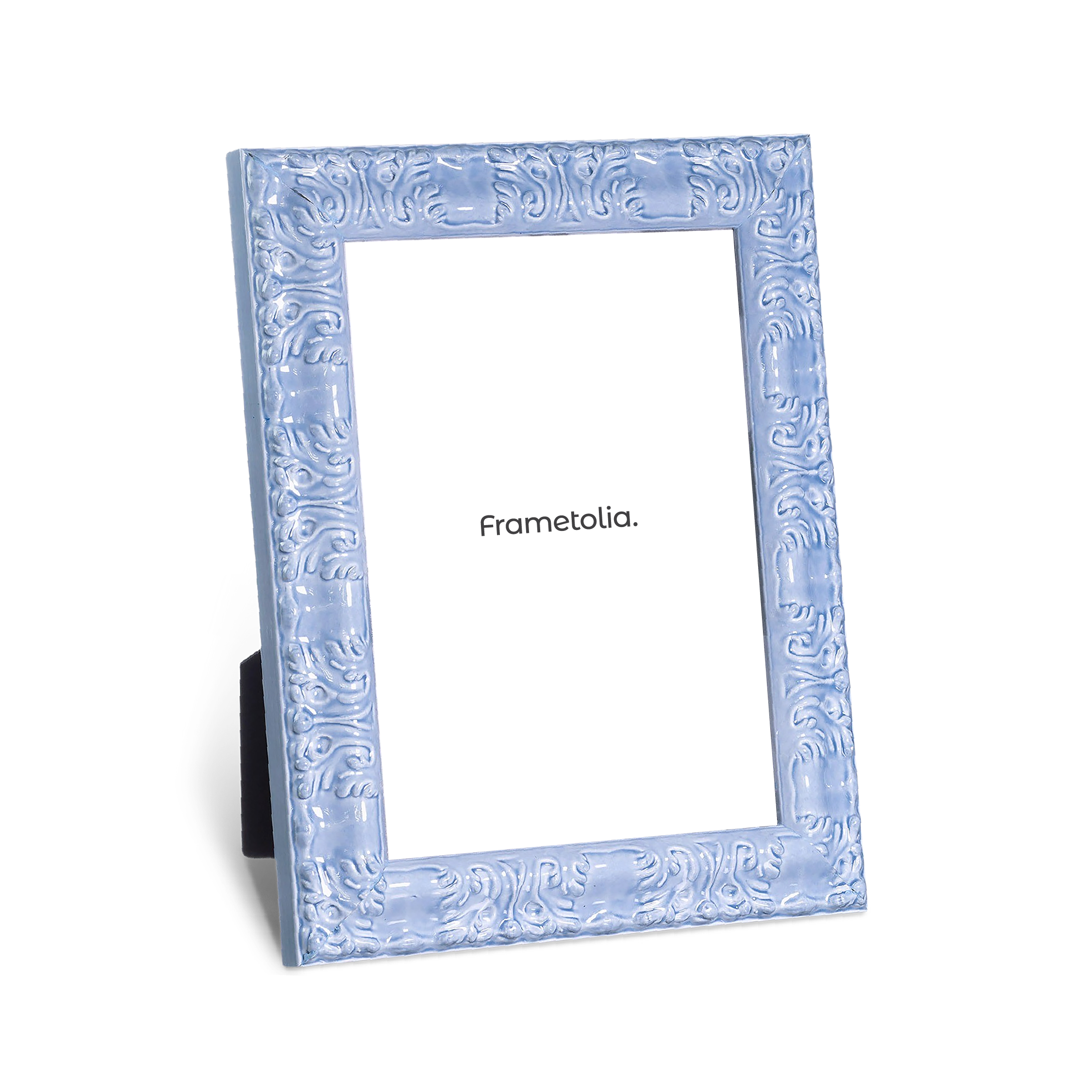
Choosing Frames for a Misty Blue and Restful Green Palette
The frame you choose will guide how the color story reads in the room. Warm woods highlight the organic side of the trend, while soft whites create a clean and airy atmosphere. For a more refined look, light maple or natural oak frames create a gentle bridge between the artwork and the surrounding palette. Our top frame suggestions are:
- Light wood frames to warm up cooler artwork
- Soft white frames for a quiet, refined feel
- Natural maple for coastal and transitional rooms
- Delicate gold accents to introduce a hint of elegance without overpowering the palette
How to Style a Room Around This Trend
Once you bring in art and frames, the rest of the room can follow the same calm rhythm. Blend textures that feel natural and cozy, and keep the palette simple so the colors can breathe. Aim for softness with intention so that every piece contributes to the overall sense of ease. Small touches in textiles, accessories, and decorative objects will help echo the misty blues and restful greens throughout the space.
- Layer misty blue bedding with woven or natural fiber throws
- Introduce sage or mint toned ceramics to create visual harmony
- Add greenery that echoes the organic palette
- Use linen curtains in pale mineral colors for a weightless look
- Mix cool tones with warm wicker or rattan to keep the space balanced

Calm Colors for a Feeling of Fresh Air
Misty blues and restful greens show no signs of slowing down as a leading color family for 2026. Their presence brings ease, harmony, and quiet sophistication into any room. When paired with well chosen artwork and handcrafted frames from Frametolia, this palette becomes even more polished and intentional. It is a trend that feels both current and timeless which makes it a beautiful investment for any home. For more inspiration check out our table top picture frames and our coastal art prints collection. Happy Decorating!