
Heritage reds and rustic warmth are shaping up to be one of the most meaningful color stories of 2026. These tones draw from clay, earth, aged pottery, and traditional textiles which gives them a timeless presence that feels both comforting and refined. They signal a shift toward interiors that celebrate craft, tradition, and a return to materials with history. When used well, these colors create a home that feels grounded and welcoming with a richness that unfolds slowly.
Why These Colors Are Trending
Designers are seeing a strong desire for spaces that feel personal and storied. After years of cool neutrals and airy palettes, many homeowners want deeper colors that add character and intention. Heritage reds are warm without being overpowering and they pair beautifully with other organic elements such as walnut wood, woven fibers, clay ceramics, and natural fabrics. These tones bring depth to a room and make even modern spaces feel more soulful. Their nostalgic quality also supports the broader trend of embracing handcrafted design and vintage inspired decor.
How to Use Heritage Reds and Rustic Warmth in Wall Art
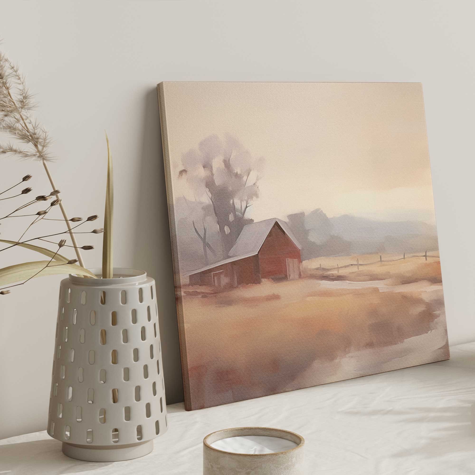
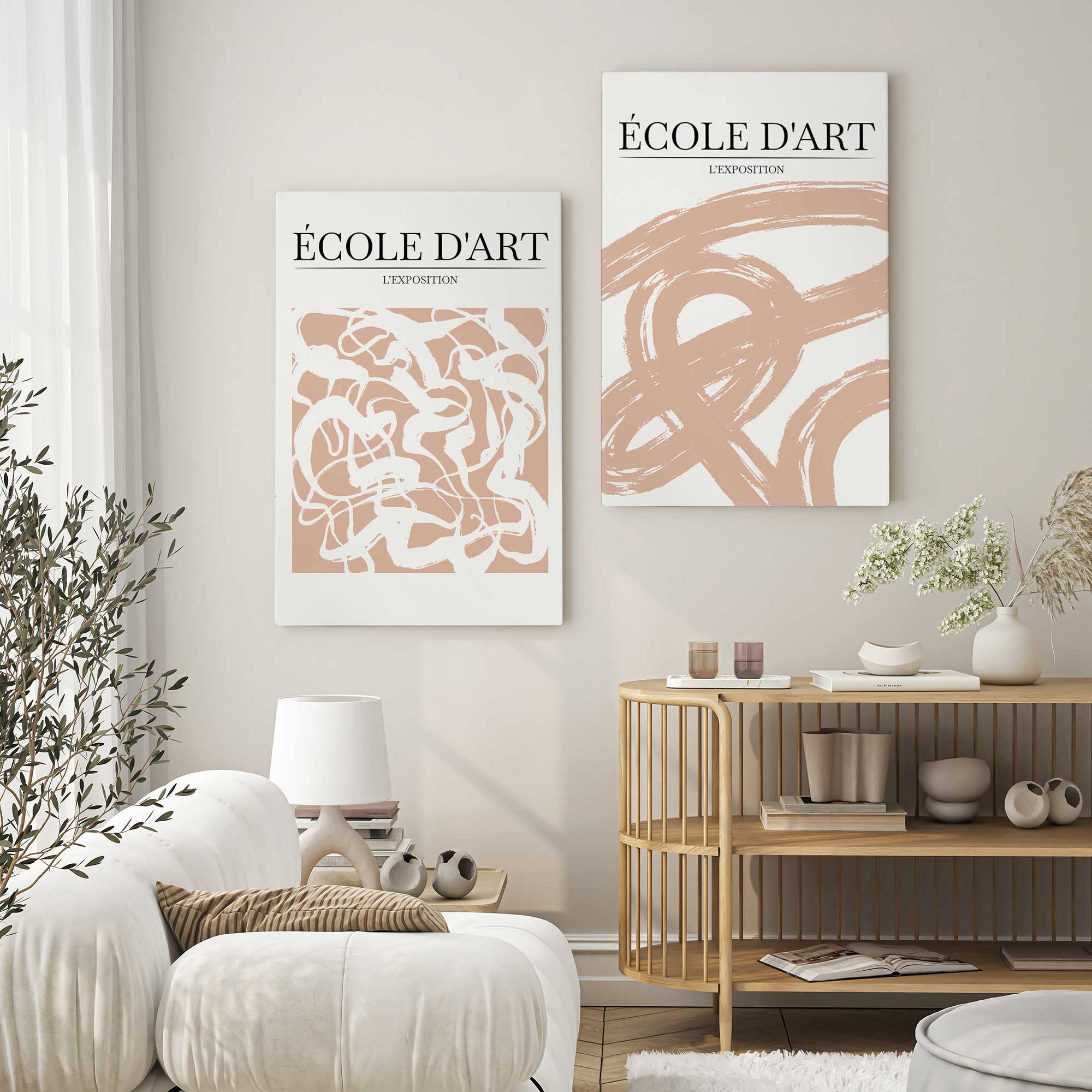
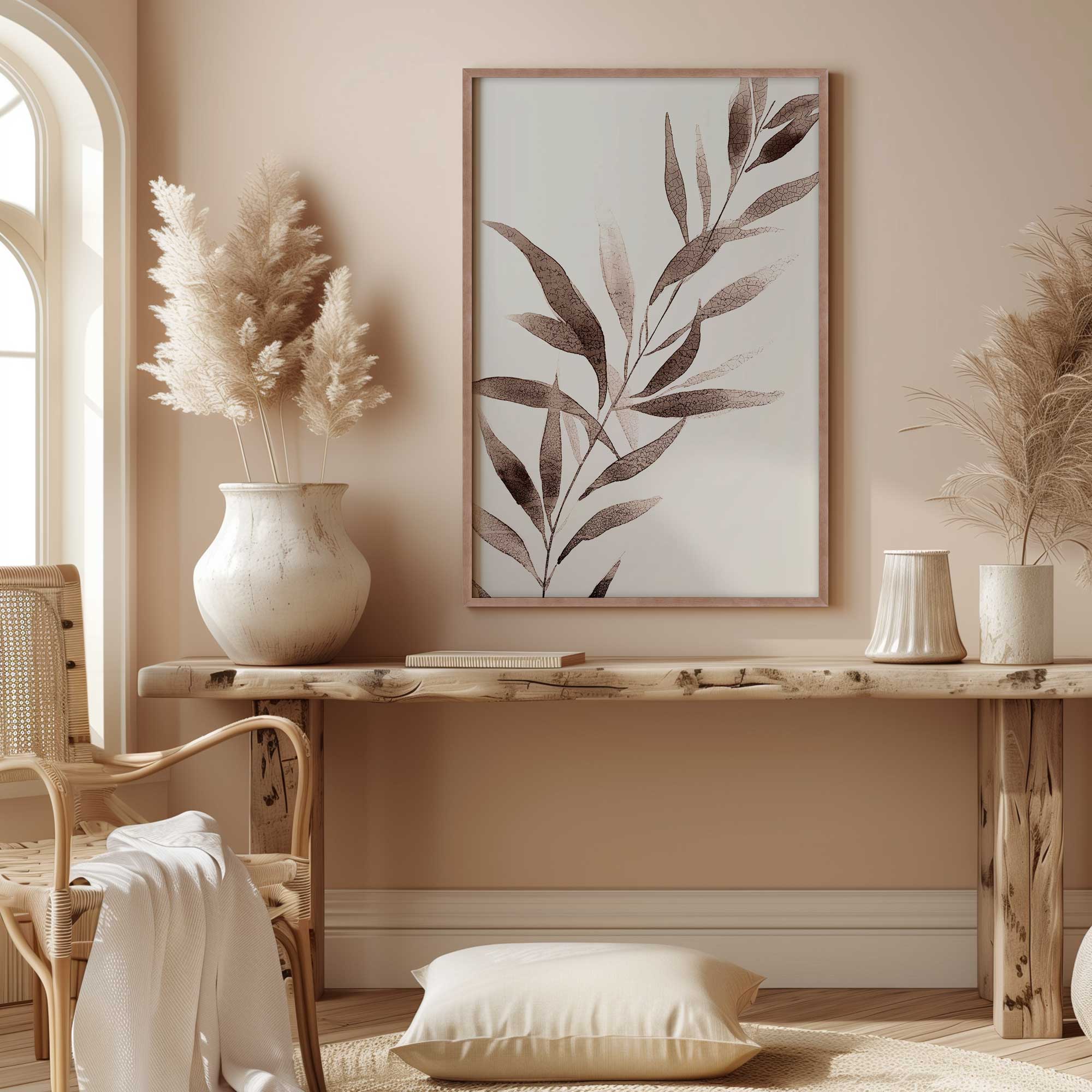
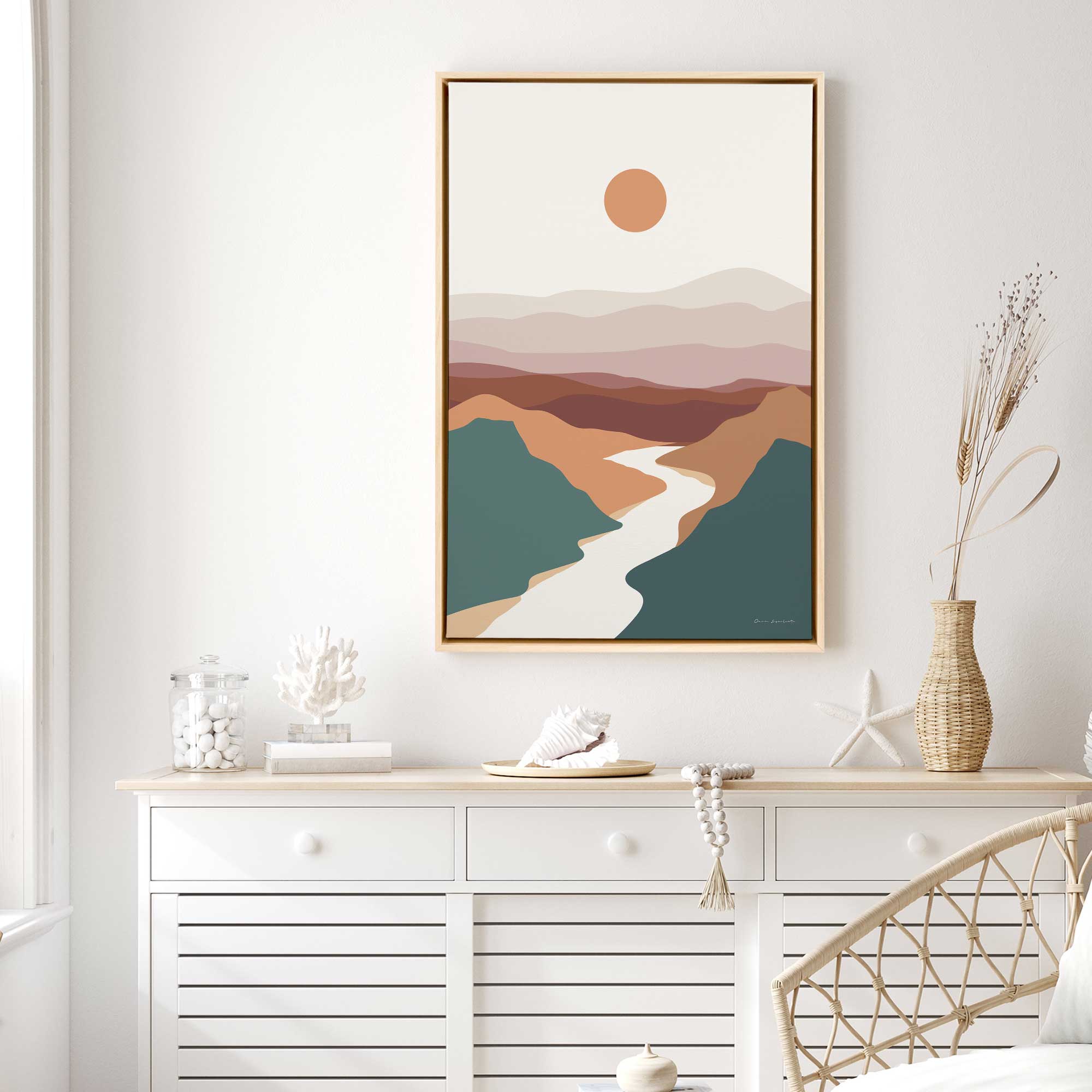
Art is a powerful way to introduce this palette without painting an entire room. Look for artwork that celebrates earth pigments, traditional craft, or warm seasonal tones. By mixing pieces with subtle variations of terra cotta, pottery red, and umber, you can create a layered look that feels collected over time. Frametolia’s handmade wood frames add another dimension of warmth which complements the richness of this color family.
- Botanical art in deep clay or burnt red tones
- Abstract pieces built around warm earth inspired color fields
- Minimal line drawings on terra cotta or pottery red backgrounds
- Seasonal foliage artwork with rich crimson and rust
- Vintage style prints that echo traditional pigments
Choosing Frames for a Heritage Red and Rustic Warmth Palette
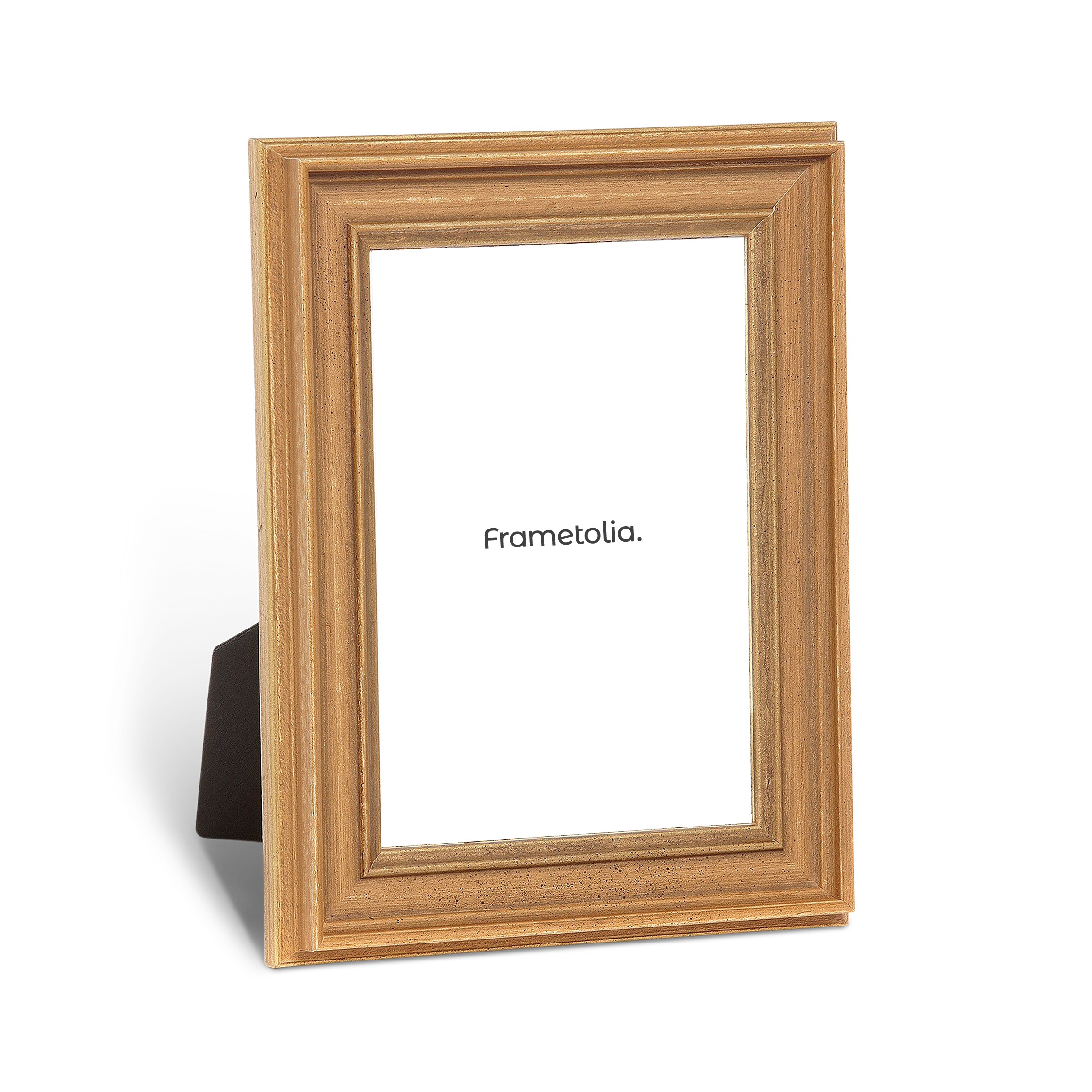
The right frame brings out the depth of this palette. Darker woods add drama and structure while lighter woods lend softness and balance. Black frames offer contrast and an elevated modern edge. Frametolia’s handcrafted frames shine especially well here because their natural finishes echo the authenticity of these colors and make the artwork feel more intentional.
- Walnut or espresso toned frames for a rich grounded feel
- Black frames to provide contrast and a refined silhouette
- Natural oak frames to add warmth and soften deeper reds
- Rustic inspired finishes for artworks with vintage character


How to Style a Room Around This Trend
This palette encourages a cozy layered environment. Add textures that feel tactile and rooted in craft to echo the warmth of the colors. Mixing materials such as wool pottery and wood can help bring the palette to life while keeping the overall look harmonious. These tones work especially well in living rooms dining spaces and entryways where hospitality is at the forefront.
- Layer throw blankets or pillows in pottery red and dark berry tones
- Introduce clay or ceramic vases with natural imperfections
- Add woven baskets or textiles to bring softness to the palette
- Use warm metal accents such as aged brass for a subtle glow
- Incorporate foliage or branches with deep red or rust undertones
Rustic Warmth That Adds Depth
Heritage reds and rustic warmth create a color palette that feels intentional comforting and full of character. These tones invite you to slow down and enjoy the beauty of traditional craftsmanship and natural materials. When paired with thoughtfully chosen artwork and handmade frames from Frametolia the palette becomes even more expressive and harmonious. It is a trend that adds real heart to the home and offers warmth in every season. For more inspiration check out our Wall Frames and 2026 color Trend Art Collection. Happy Decorating!