
When you're choosing wall art, color usually gets all the attention. But contrast is just as important, and often more impactful. The difference between low contrast art and high contrast art can completely change how a room feels, even if the colors stay the same. Understanding contrast helps you choose art that feels right for your space rather than art that simply looks good on its own. If you have ever wondered why one piece of art feels calm and blended while another instantly grabs your attention, contrast is usually the reason.
What Does Contrast Mean in Art?
So what does contrast mean in art? In simple terms, contrast is the difference between elements within an artwork. This often shows up as light versus dark, soft versus bold, or subtle color changes versus dramatic ones. High contrast in art means those differences are strong and noticeable, while low contrast in art means the changes are gentle and closely related.
Color and contrast in art work together to guide your eye. High contrast pulls attention quickly and creates energy, while low contrast slows the eye down and creates a smoother, more relaxed experience. Neither approach is better on its own. The right choice depends on how you want the room to feel and how the artwork fits into the space around it.
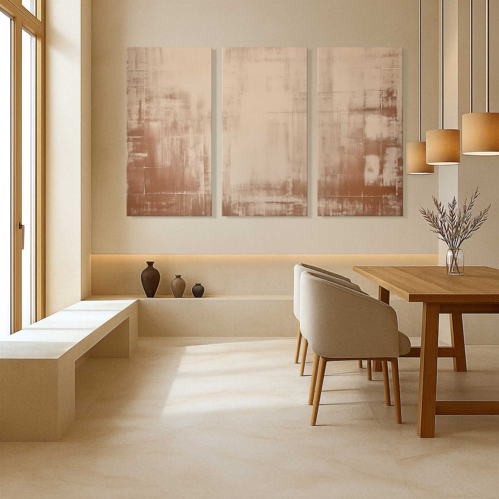
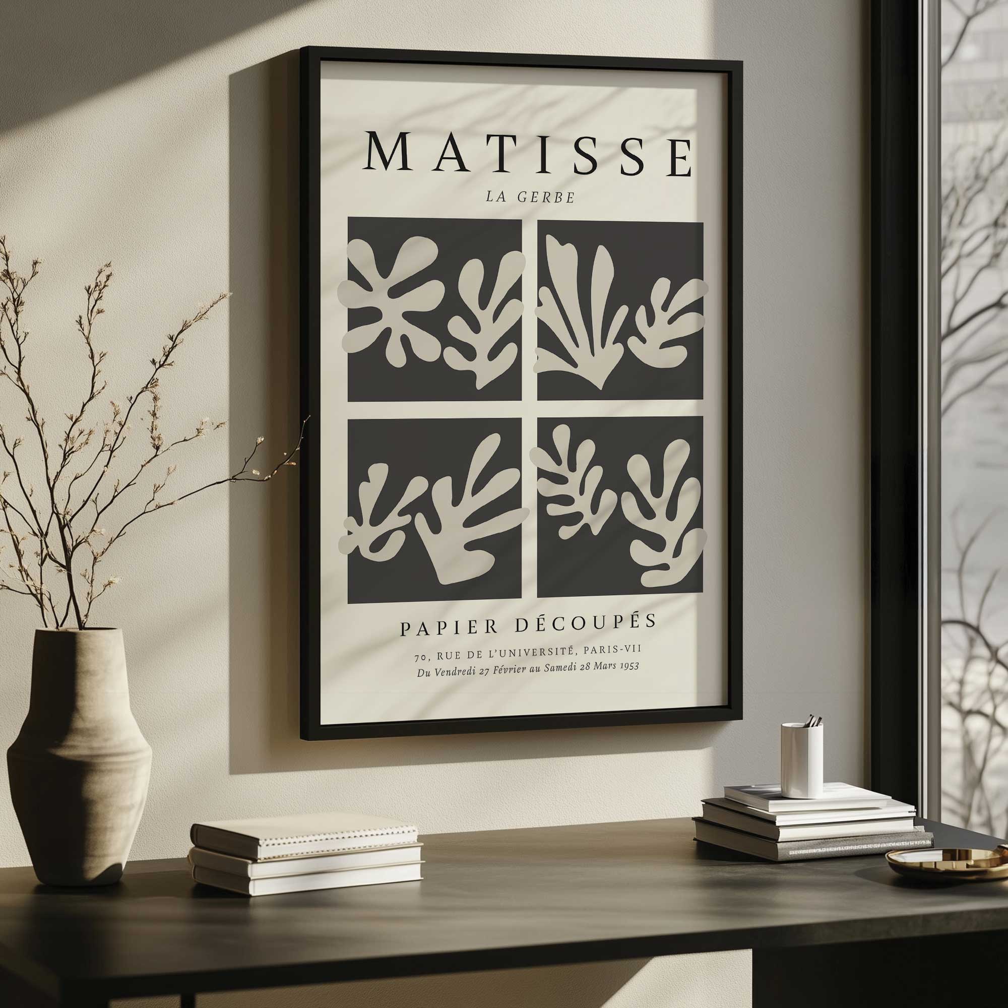
Low Contrast Art: Calm and Easy on the Eye
Low contrast art tends to feel quiet and cohesive. These pieces use similar tones, soft color shifts, and minimal visual tension. Instead of standing apart from the room, they settle into it. This makes low contrast art especially appealing if you want your space to feel layered, thoughtful, and comfortable rather than bold or dramatic.
Because low contrast art does not rely on sharp differences, it works best when the surrounding elements help support it. Texture, lighting, scale, and framing all play a bigger role in helping the artwork feel complete and intentional.
When low contrast art works best
Low contrast art is a strong choice in spaces where you want visual flow instead of interruption. It works especially well when the room already has depth through materials and finishes rather than strong color contrast.
- Rooms built around neutral palettes like beige, cream, soft gray, or warm white
- Bedrooms, sitting rooms, and other spaces meant for rest and quiet
- Interiors that use texture such as wood, linen, stone, or woven accents
- Open layouts where you want art to connect areas rather than divide them
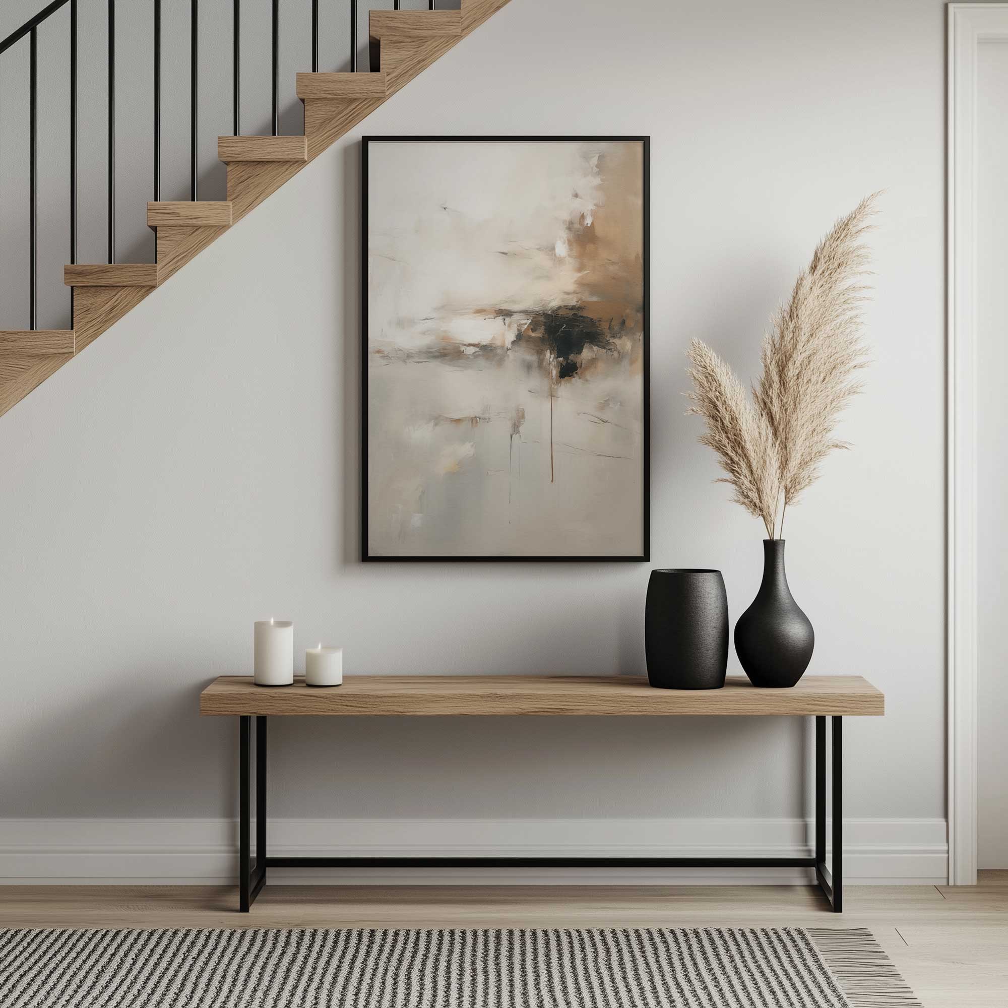
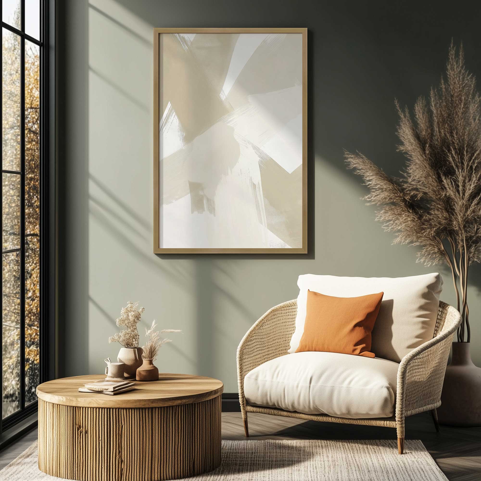
How to decorate with low contrast art
Since low contrast art blends more easily into its surroundings, it is important to give it enough presence. Size, placement, and framing help ensure the artwork feels intentional rather than understated. Low contrast art is ideal if you want your walls to feel calm, cohesive, and timeless.
- Choose artwork with undertones that match your walls or furnishings
- Go a bit larger than you think you need so the art reads clearly from across the room
- Use a well made wood frame to add structure and definition
- Group similar low contrast pieces together for a soft but polished look

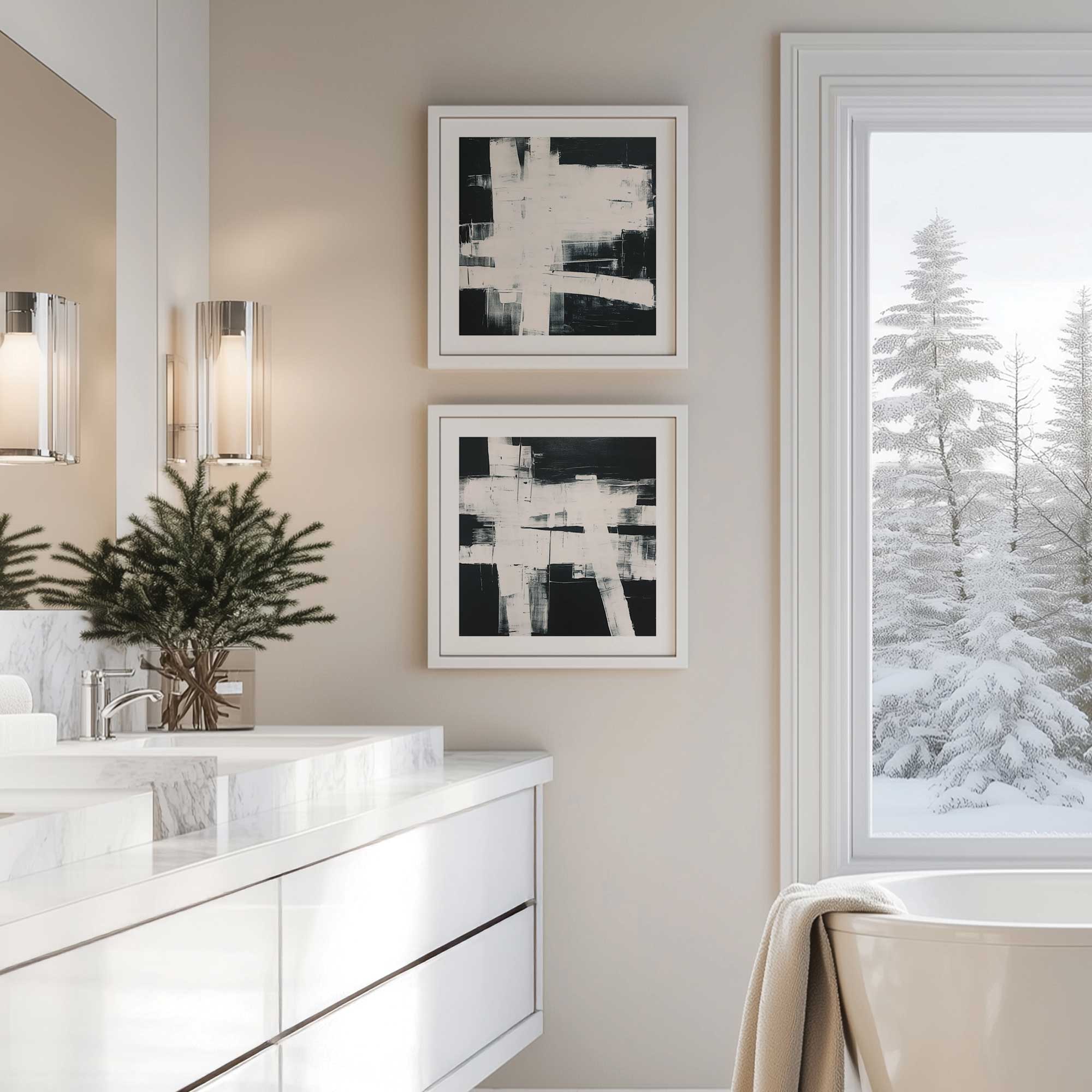
High Contrast Art: Bold and Full of Energy
High contrast art is meant to be seen. Strong light and dark differences, graphic shapes, or bold color pairings create immediate impact. This type of art naturally becomes a focal point, which is why high contrast art examples are often used in modern and minimalist interiors.
High contrast in art works especially well when a room feels flat or unfinished. A single piece with strong contrast can add clarity and direction to the entire space. The key is balance. When the art is bold, the surrounding decor should be more restrained.
When high contrast art works best
High contrast art shines when a room needs energy or a clear visual anchor. It gives the eye something to land on and can define the mood of the space almost instantly.
- Minimal or monochromatic rooms that feel too uniform
- Dining rooms, home offices, and entryways where you want visual impact
- Spaces with simple furniture and clean lines
- Smaller wall areas where art needs to make a statement
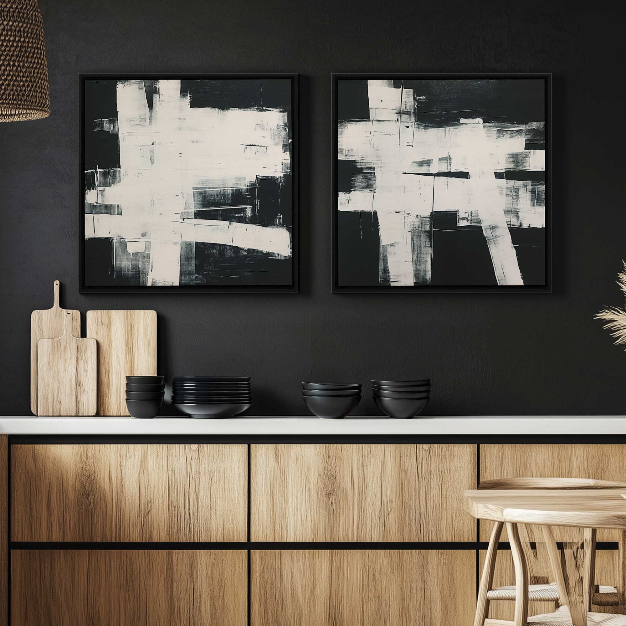
How to decorate with high contrast art
When working with art with contrast, it helps to let the artwork take the lead. Everything around it should support the piece rather than compete with it. High contrast art is a great choice if you want your space to feel expressive, confident, and intentional.
- Keep nearby decor simple so the artwork remains the focal point
- Pull one color from the artwork into pillows, rugs, or accessories
- Give the piece space so it does not feel crowded
- Use a strong frame finish to ground the artwork visually

How to Choose Between Low Contrast and High Contrast Art
If you are stuck deciding between these two styles, start by looking at the room as it exists today. Think about how much visual activity is already happening. Contrast should support the room, not compete with it.
- Dark walls often pair well with lighter or higher contrast artwork
- Busy furniture patterns usually benefit from lower contrast art
- Bright rooms can handle bolder contrast more easily than dim ones
- Consider whether the art should blend in or stand out
Using Both Styles in One Home
Most homes benefit from a mix of contrast levels. Using low contrast art in private spaces and high contrast art in social areas creates natural flow and balance. Keeping framing consistent helps everything feel connected and intentional.
Final Thoughts
Low contrast art and high contrast art are simply different tools. Once you understand what contrast means in art and how color and contrast in art affect mood, choosing becomes much more intuitive. When contrast, artwork, and framing work together, your walls start to feel like a natural part of your home rather than an afterthought. For more high contrast art check out our exclusive Noir Nest Atelier collection, for more low contrast art check out Legacy Luxe Living. Happy Decorating!