

Burlwood frames bring pattern and depth to a wall before the artwork even comes into focus. Their swirling grain inspired look gives them more visual interest than a simple solid frame, which makes them especially useful when a room needs warmth, contrast, or a little character. The key is choosing a finish that works with both the artwork and the rest of the room, rather than treating the frame as an afterthought.
Pair Lighter Burl Finishes with Soft, Airy Artwork
Lighter burl finishes work beautifully with artwork that has a quiet palette and plenty of open space. Think pale landscapes, soft abstracts, botanical studies, or artwork with cream, beige, blush, and muted blue. The subtle pattern around the edge adds interest without making the finished piece feel heavy.
- Pair light burl with ivory, warm white, sand, and pale gray artwork.
- Use it with soft botanical prints or understated landscapes.
- Place it against cream or warm white walls for an easy, layered look.
- Combine it with linen, boucle, pale upholstery, and simple furniture.
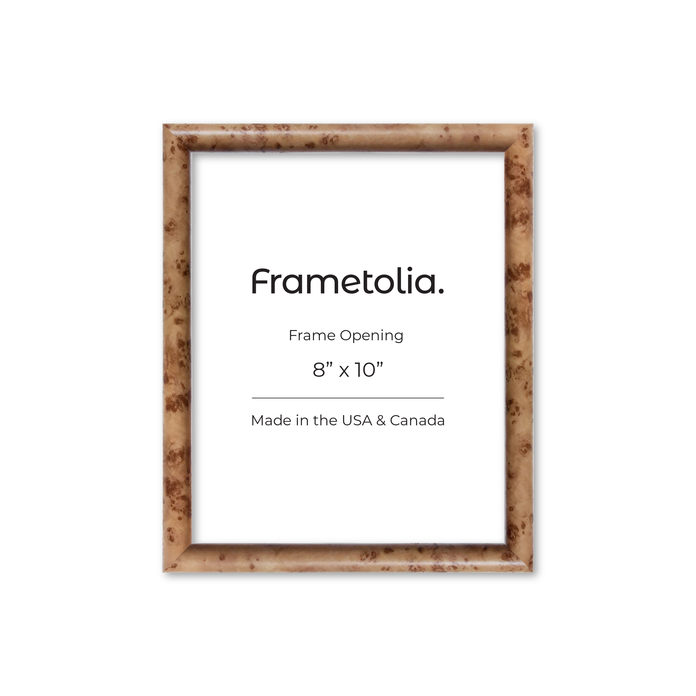
Use Medium Burl Tones to Warm Up a Neutral Room
A medium burl finish is a good choice when you want more contrast without going too dark. It works especially well in rooms with warm neutrals, walnut tones, camel upholstery, or brass accents. A burlwood photo frame in this tone can also make personal photography feel more considered, especially on a console, bookshelf, or dresser.
- Pair medium burl with black and white photography for a warmer presentation.
- Use it alongside caramel, tan, rust, and deep cream.
- Repeat similar brown tones through furniture or smaller accessories.
- Let the frame stand out against lighter walls for added definition.
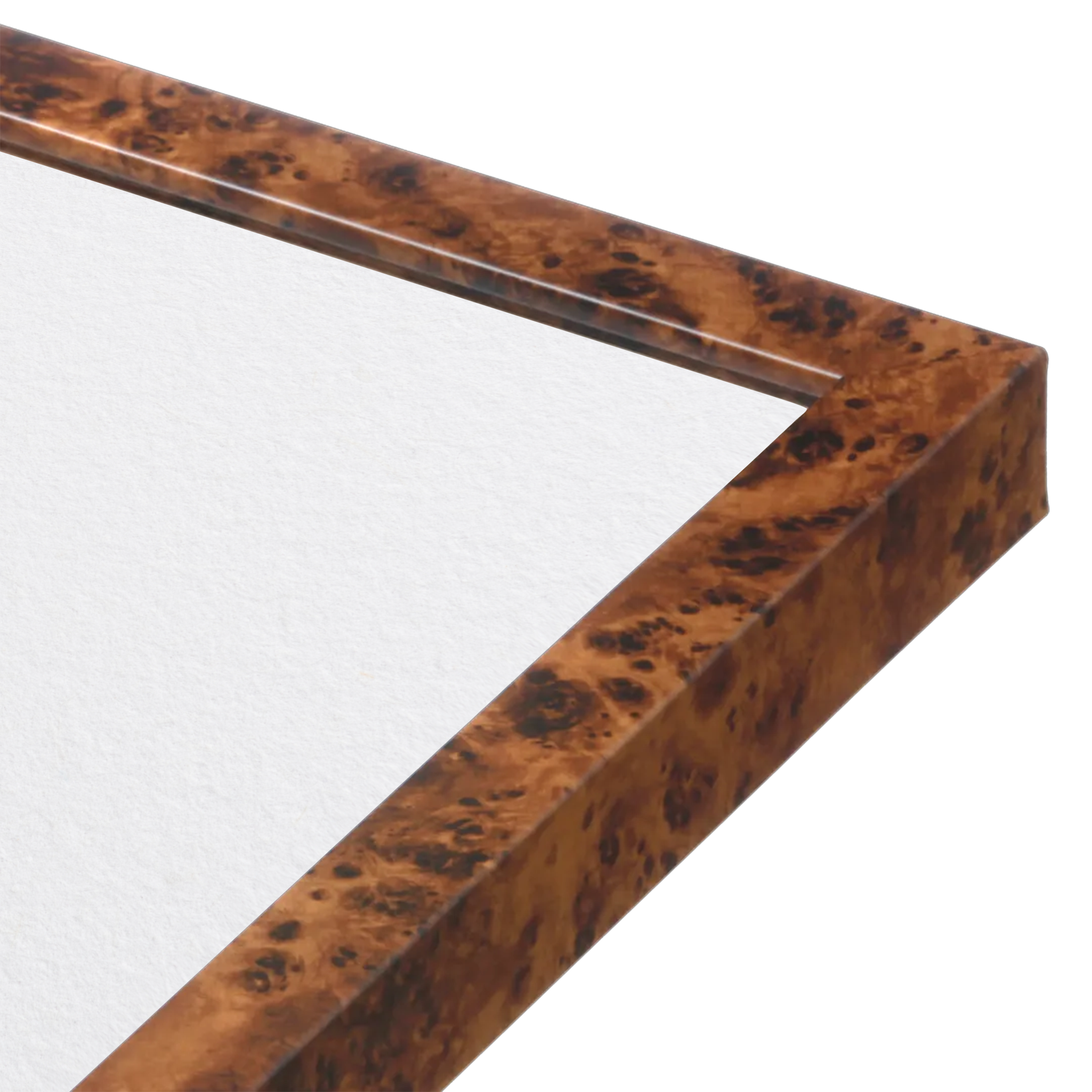
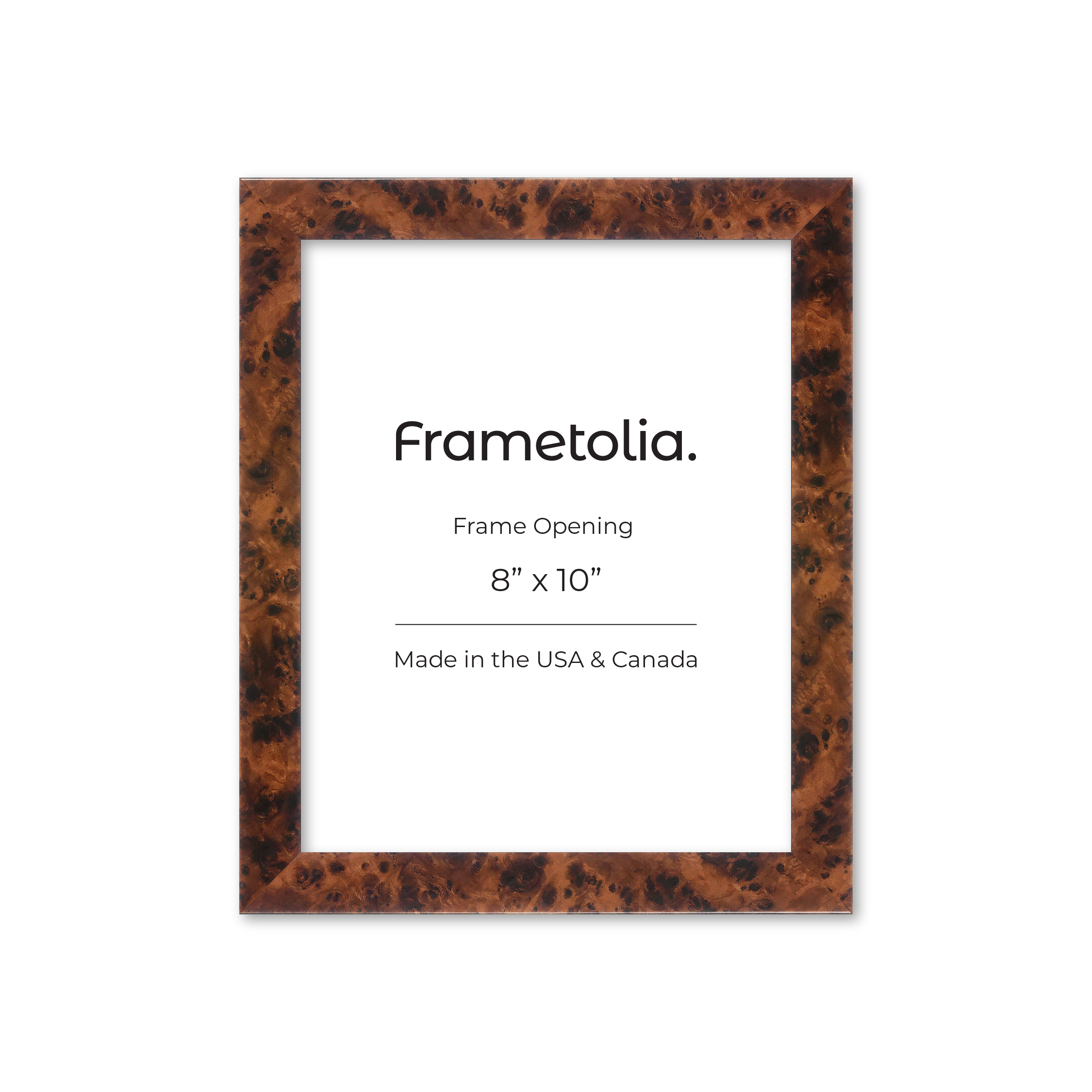
Let Dark Burl Finishes Make a Stronger Statement
Darker burl frames have more presence, especially when the pattern includes deep brown, black, amber, or reddish tones. They work well with bold photography, vintage inspired art, graphic abstracts, and richer color palettes. Because the frame already has plenty of movement, the best pairings usually have a clear focal point rather than too many competing details.
- Pair dark burl with black, charcoal, rust, deep green, and warm red.
- Use it around dramatic photography or strong abstract compositions.
- Place it in rooms with darker woods, leather, or aged metal accents.
- Keep nearby accessories simple so the frame and artwork can hold attention.
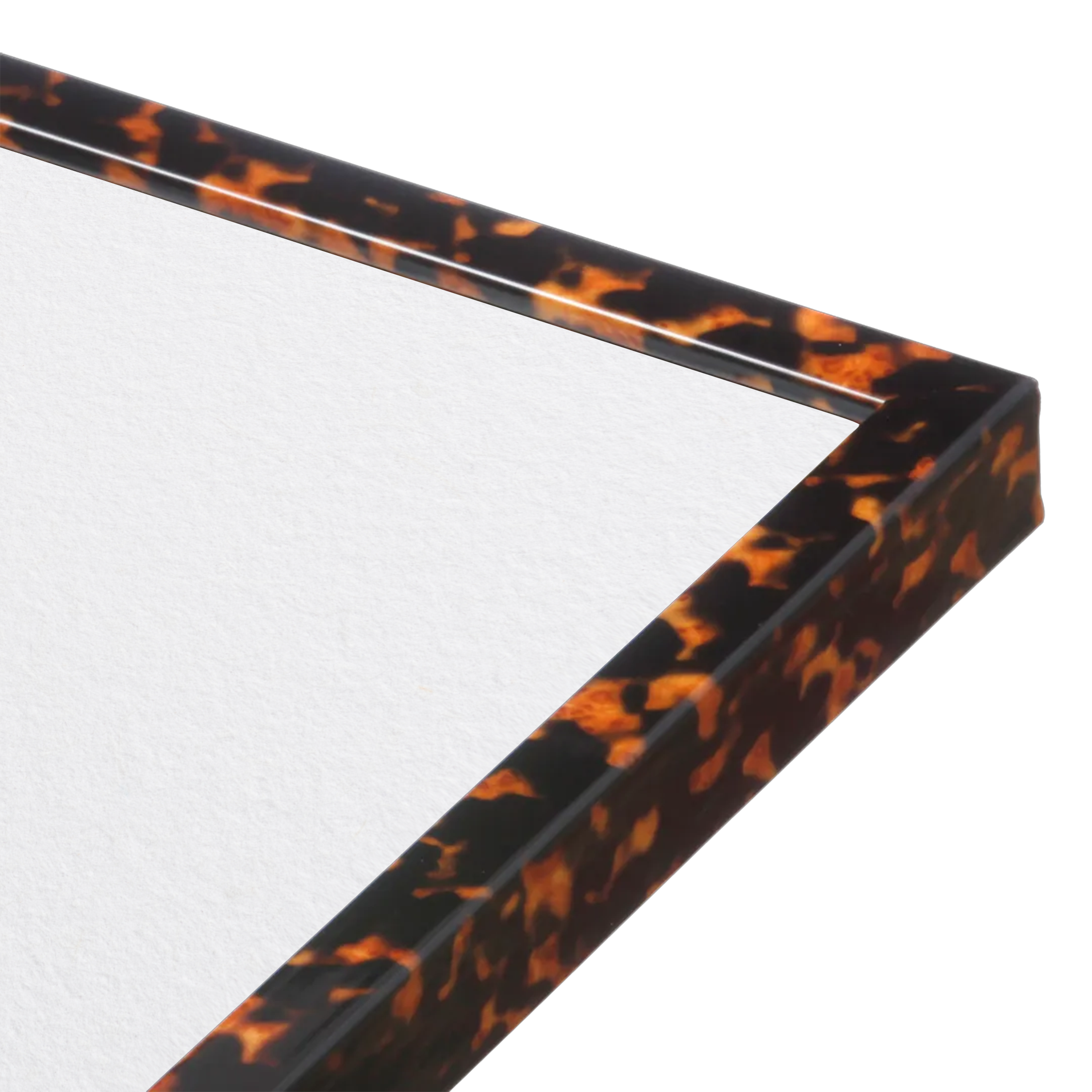
Match the Frame to the Artwork, Not Just the Room
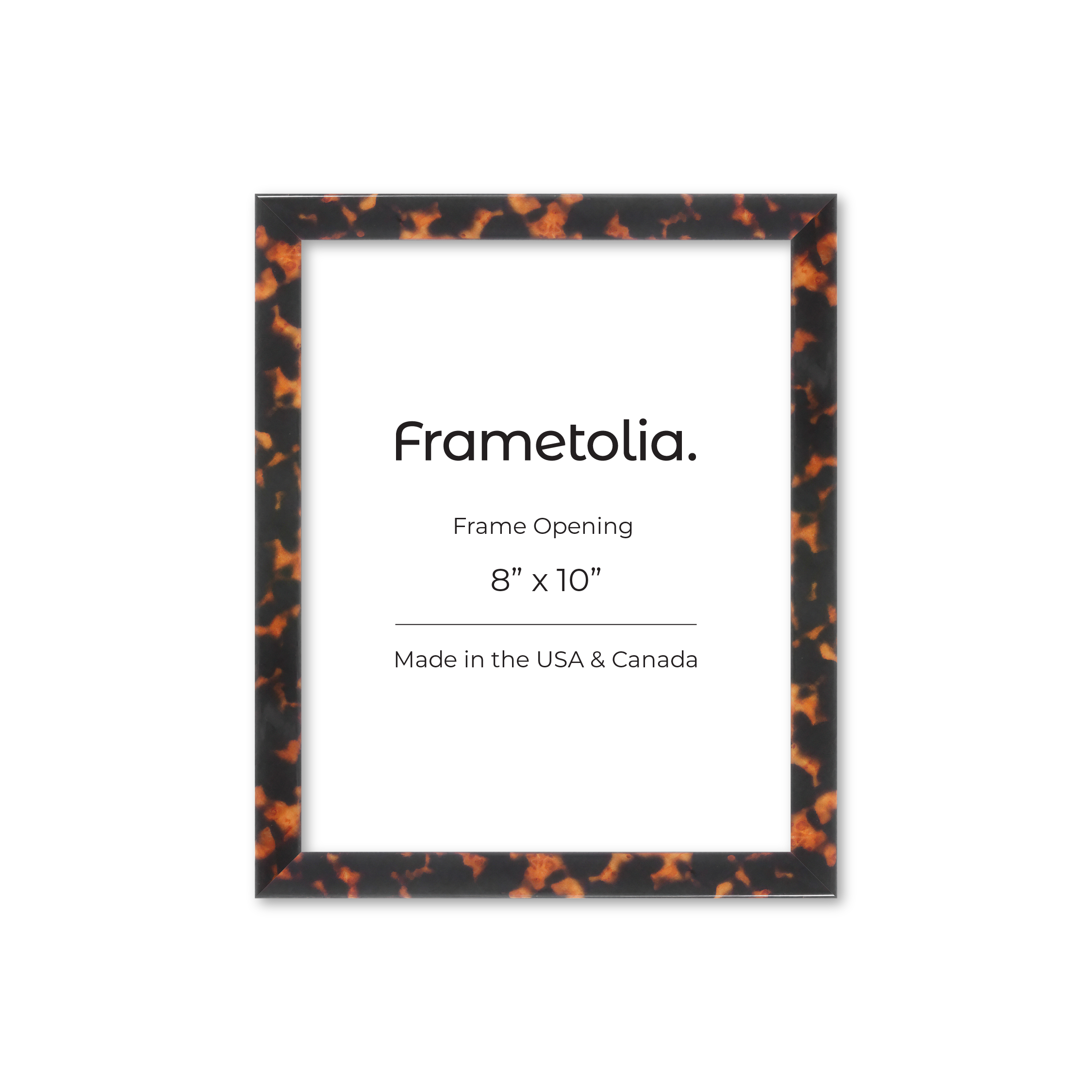
It is tempting to choose a frame based only on the furniture around it, but the artwork should lead the decision. Burl wood frames work best when at least one tone in the frame connects back to the image. That connection may be subtle, such as a warm brown in a landscape, an amber detail in an abstract, or a cream background that works with a lighter burl pattern.
- Pull one secondary color from the artwork into the frame choice.
- Use lighter finishes when the image feels soft and open.
- Choose deeper burl tones when the artwork has stronger contrast.
- Avoid pairing a very busy frame with artwork that has equally busy detail.
Use Burl Frames to Add Interest to a Gallery Wall
Burl can also work as part of a larger wall arrangement. One burlwood wall frame mixed with simple black, brown, or cream frames can make a gallery wall feel more collected and less uniform. The trick is repeating a color or finish elsewhere in the grouping so the patterned frame feels connected to the rest of the display.
- Use one burl frame as an accent among simpler frames.
- Repeat warm brown or amber tones across several artworks.
- Mix frame widths while keeping the overall palette connected.
- Give patterned frames a little more visual space within the arrangement.
A Frame That Becomes Part of the Decor
The appeal of burl finishes comes from the fact that they do more than simply border the artwork. Their pattern brings another layer to the room, whether the look is soft and subtle or rich and dramatic. Choose the finish that connects naturally with your art and color palette, and the frame becomes part of the overall design rather than something added at the end. For more inspiration check out our burlwood wall frames. Happy decorating!


