
Sometimes it’s not the artwork that needs changing, it’s how it’s displayed. Small shifts in height, spacing, and framing can completely transform how your wall art feels in a space. When everything is placed with intention, even simple pieces start to look elevated and thoughtfully curated. These are the subtle adjustments designers rely on to make wall art look polished, balanced, and professionally styled.
Hang at the Right Height Every Time
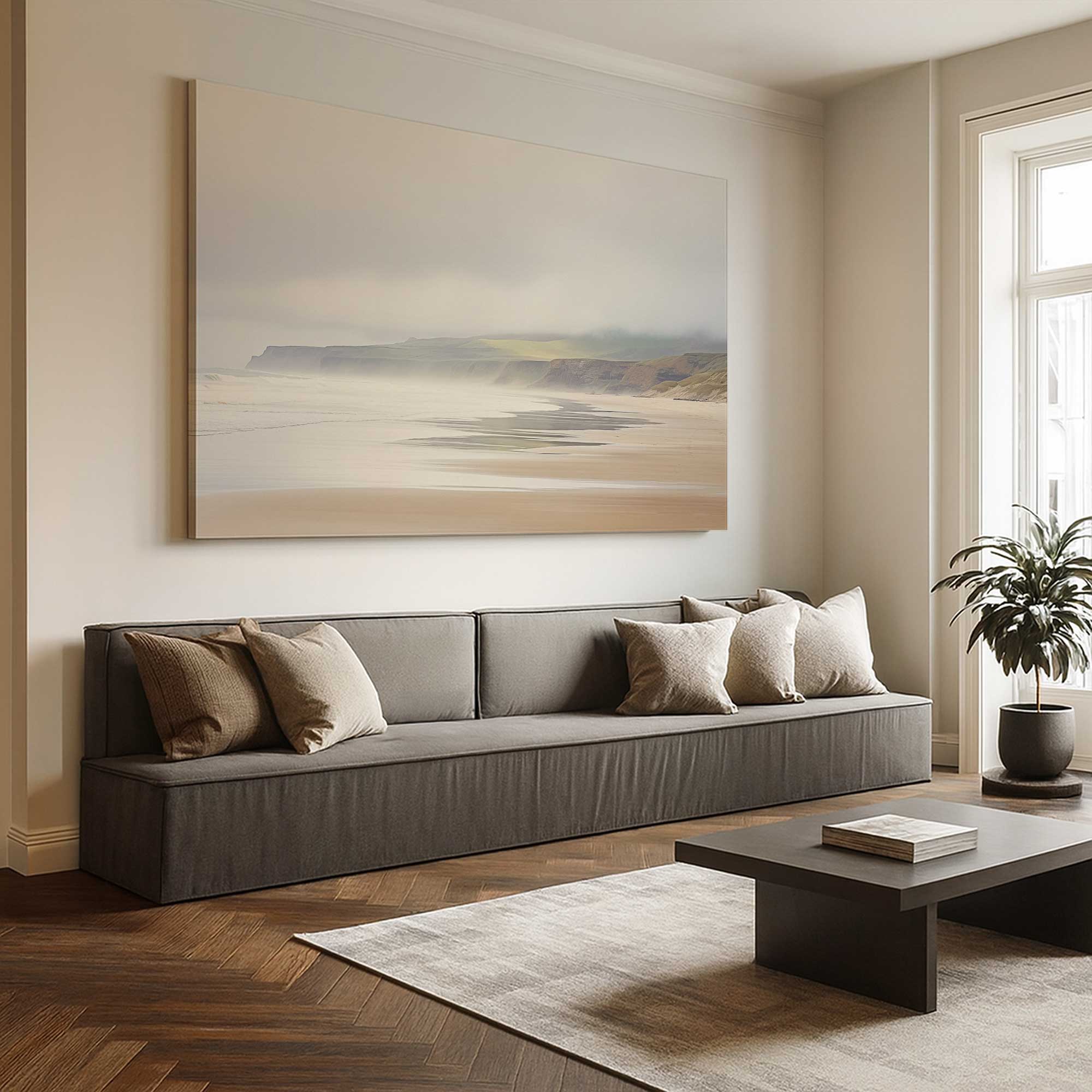
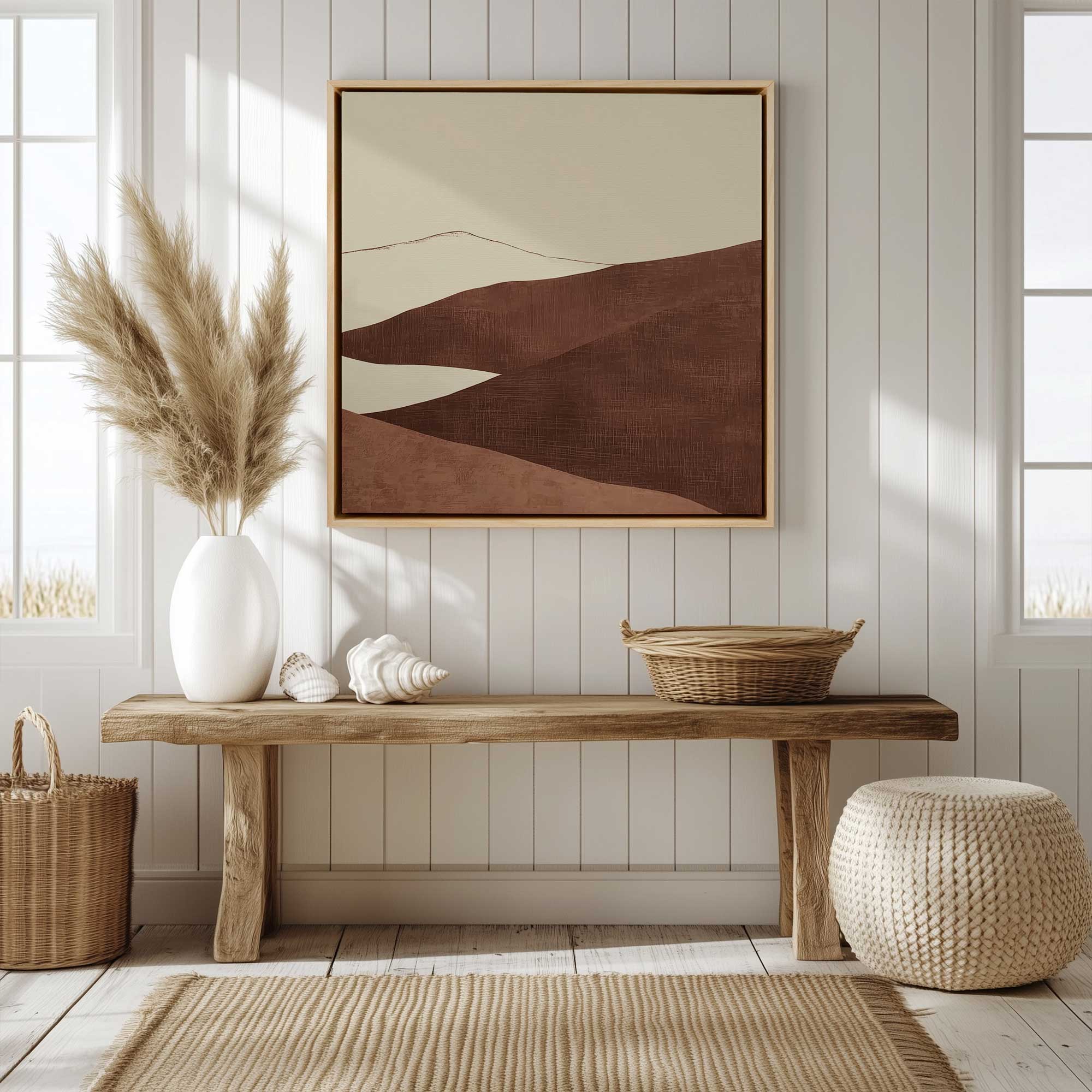
One of the most common reasons wall art feels slightly off comes down to height. When artwork is hung too high, it disconnects from the room and feels like it’s floating instead of grounded. A more professional look comes from placing art where the eye naturally rests, which helps everything feel cohesive and intentional. This one adjustment can instantly elevate even the simplest piece.
- Aim for the center of your artwork to sit around 57 to 60 inches from the floor
- When hanging above furniture, keep the bottom of the frame 6 to 10 inches above it
- In gallery walls, align pieces along a consistent center line instead of the tops
- For taller ceilings, resist the urge to go higher and keep art anchored to the space
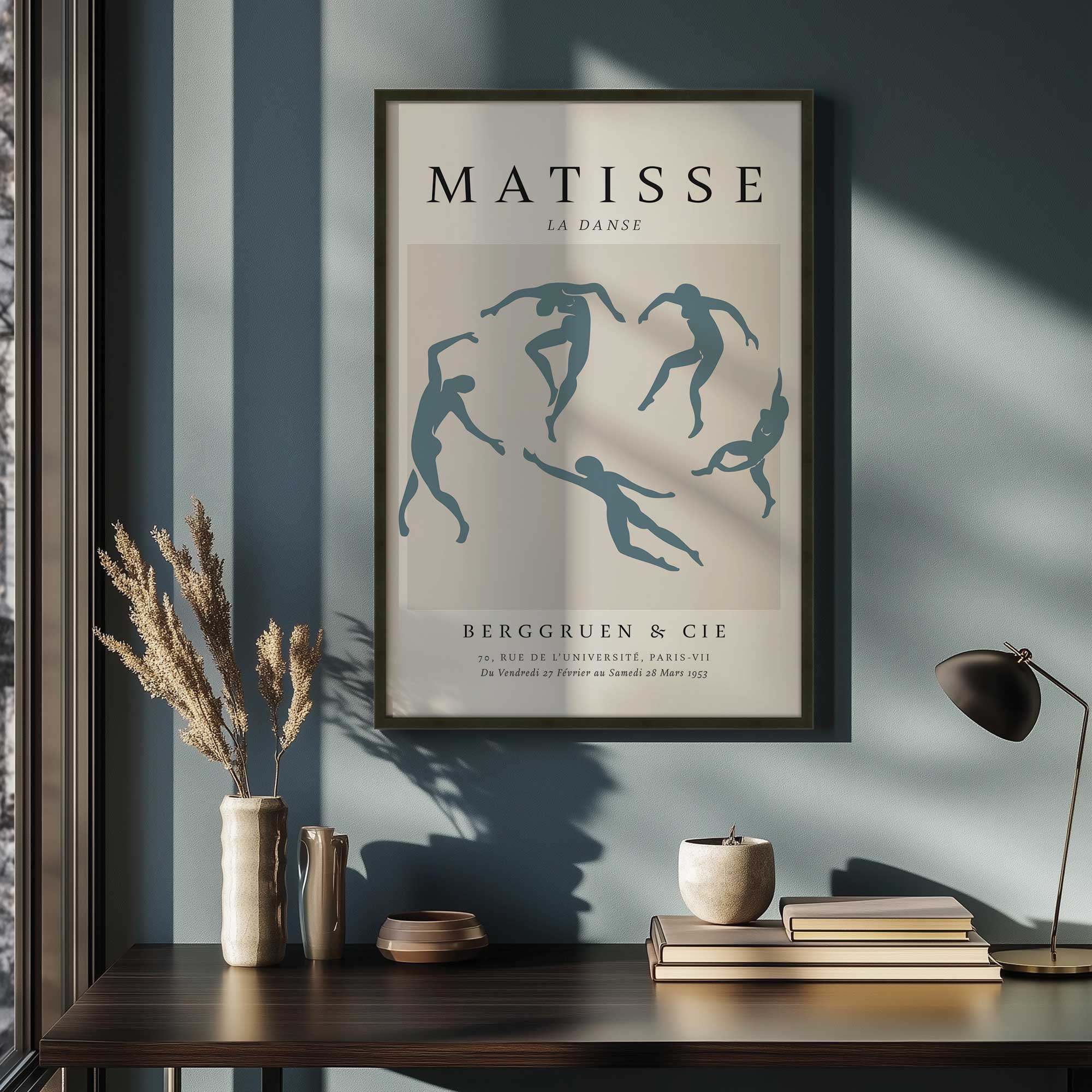
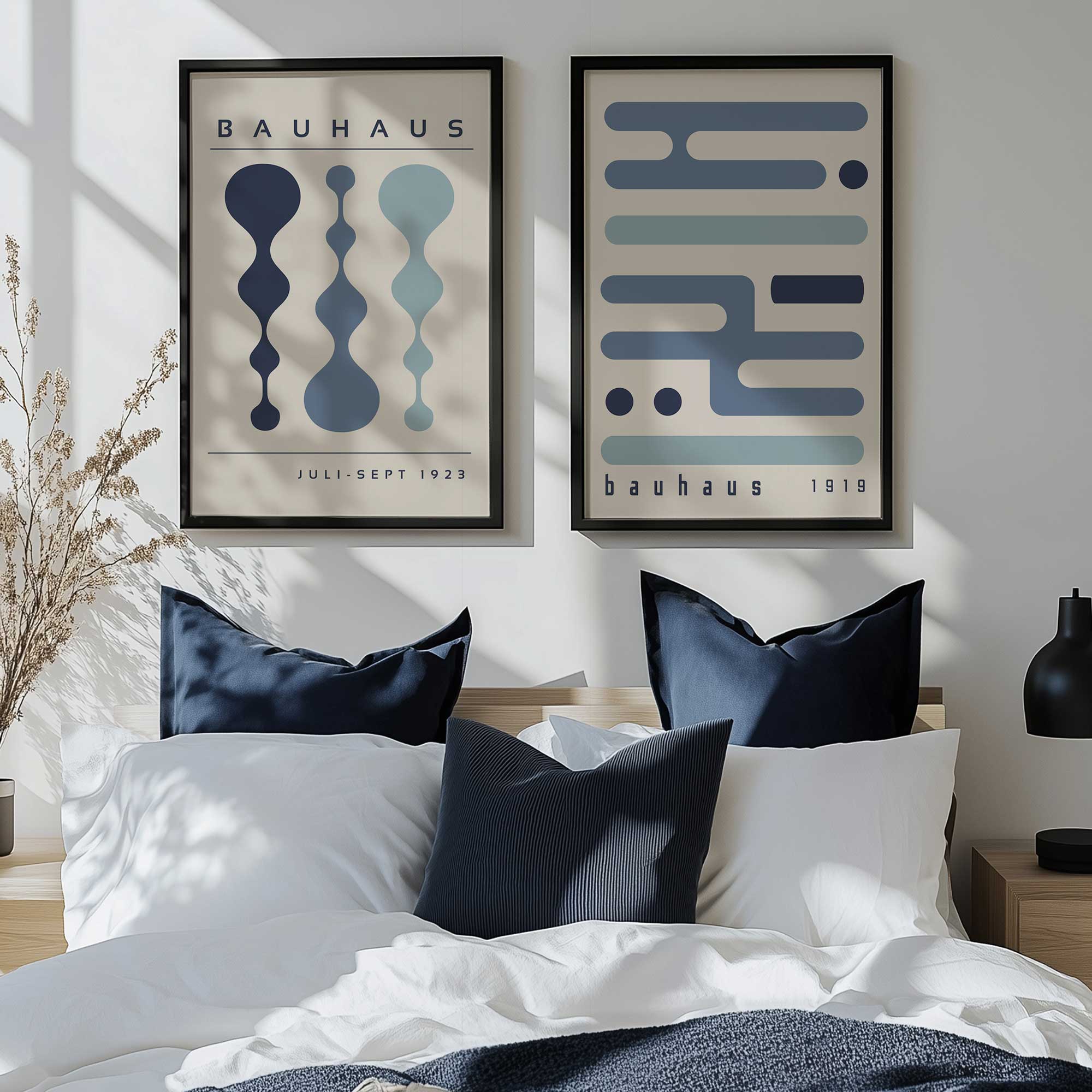
Choose the Right Frame Thickness and Style
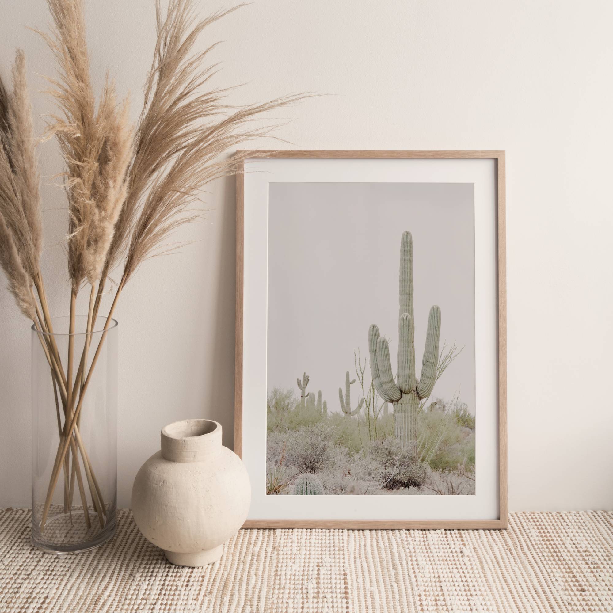
The frame you choose plays a huge role in how polished your wall art looks. Thin, low quality frames can make artwork feel unfinished, while overly bulky frames can overwhelm it. A well chosen frame should complement the art and quietly elevate it without competing for attention. This balance is what gives spaces that curated, designer feel.
- Use slightly thicker wooden frames for larger pieces to add presence and structure
- Match warm wood tones with warm toned artwork and cool tones with cooler palettes
- Keep frame styles consistent within the same room for a cohesive look
- Opt for simple, clean profiles when working with modern or minimal art
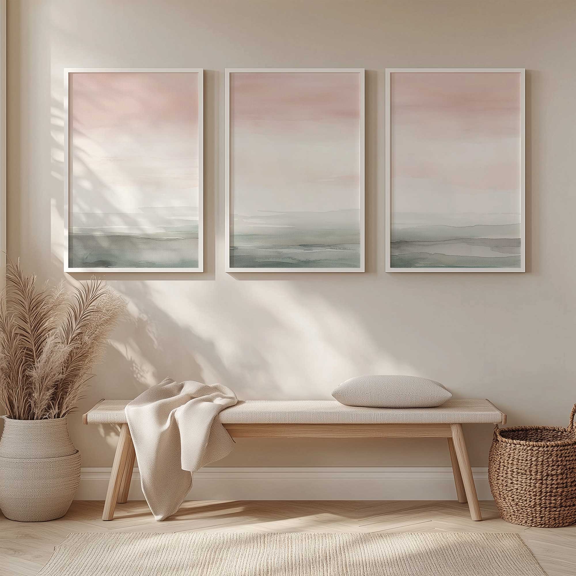
Pay Attention to Spacing and Layout
Spacing is where many gallery walls and multi piece layouts fall apart. Too much space makes pieces feel disconnected, while spacing that’s too tight creates visual clutter. Consistent spacing creates rhythm and helps the eye move comfortably across the wall. This is one of the easiest ways to make a setup feel intentional rather than accidental.
- Keep spacing between frames consistent, ideally 2 to 3 inches
- Lay out your arrangement on the floor first before committing to the wall
- Treat grouped pieces as one unit and center that unit, not each piece individually
- Use painter’s tape to map out placement before hanging
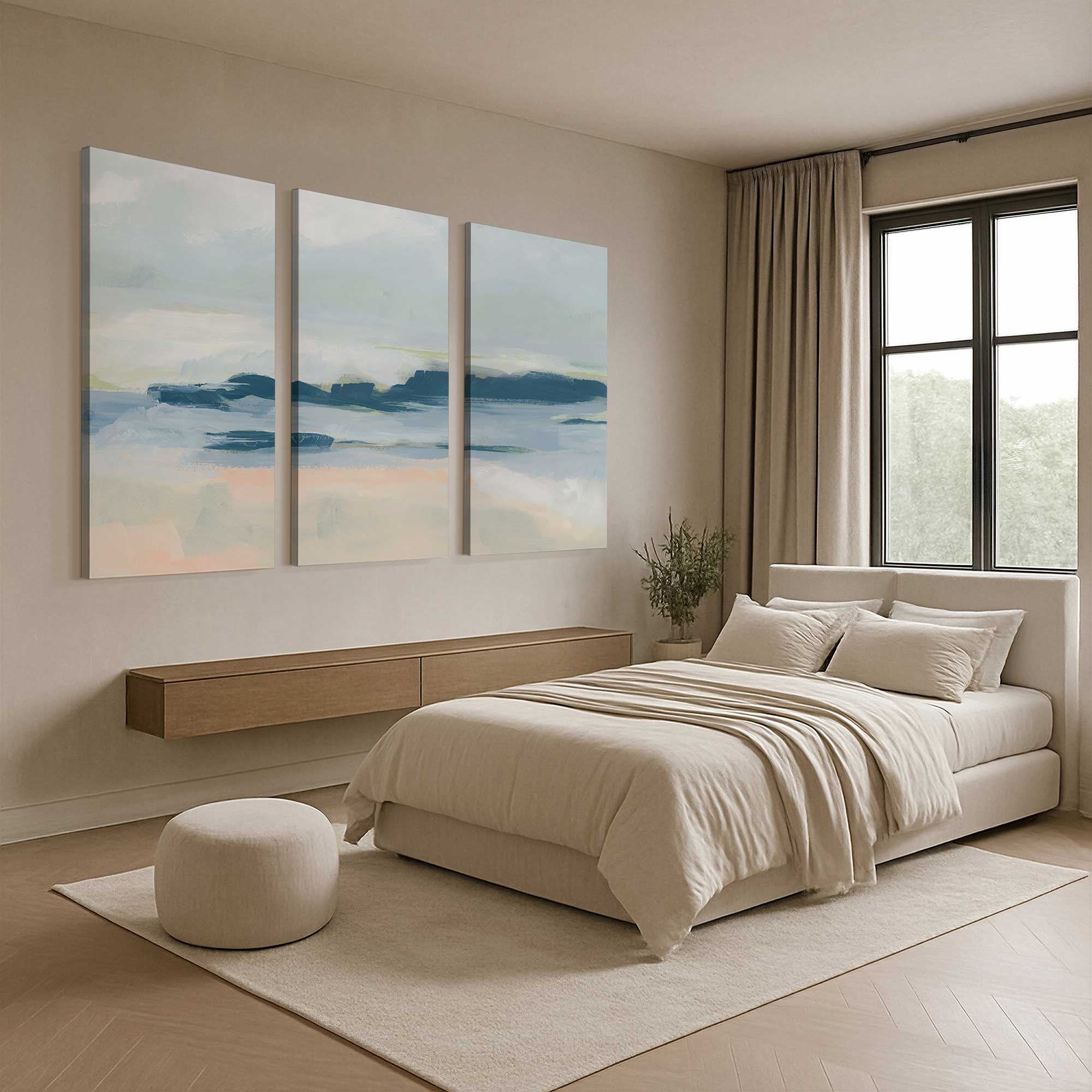
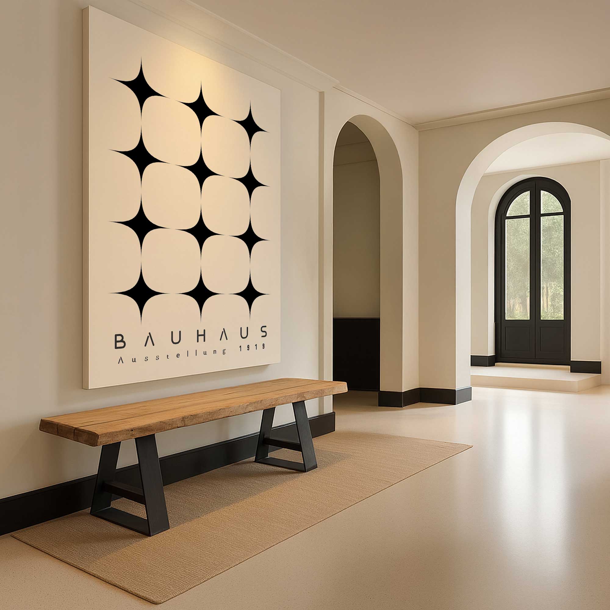
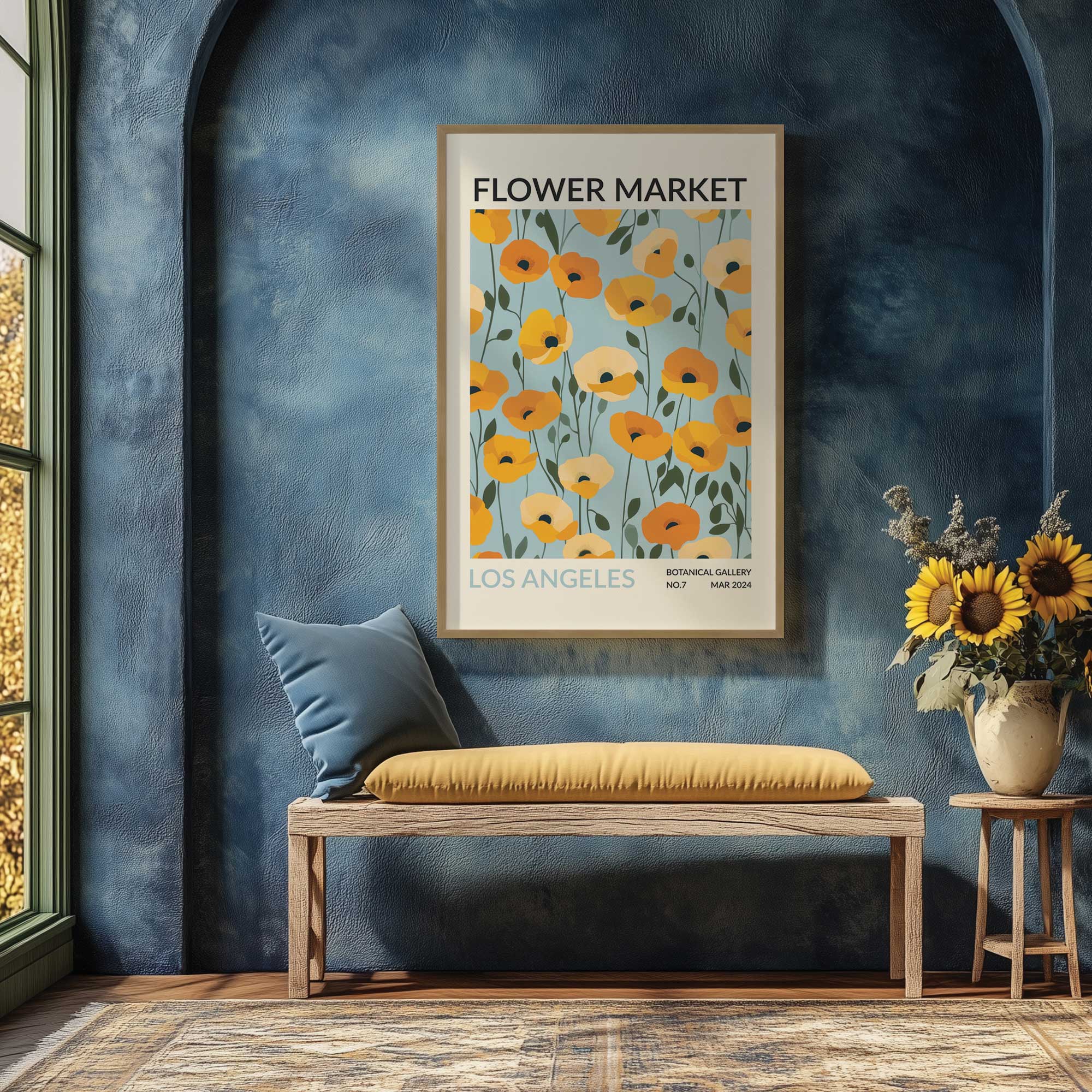
Scale Your Art to the Wall and Furniture
Even beautiful artwork can feel wrong if the scale is off. Pieces that are too small get lost, while oversized pieces can feel overwhelming if not balanced properly. The goal is to create proportion between your art, your furniture, and the surrounding wall space. When scale is right, everything feels intentional and professionally styled.
- Artwork above furniture should be about two thirds the width of the piece below
- Use larger statement pieces instead of multiple small ones to reduce visual clutter
- Fill vertical space with stacked pieces or oversized formats rather than leaving gaps
- Avoid art that feels too tiny for the wall and size up when needed

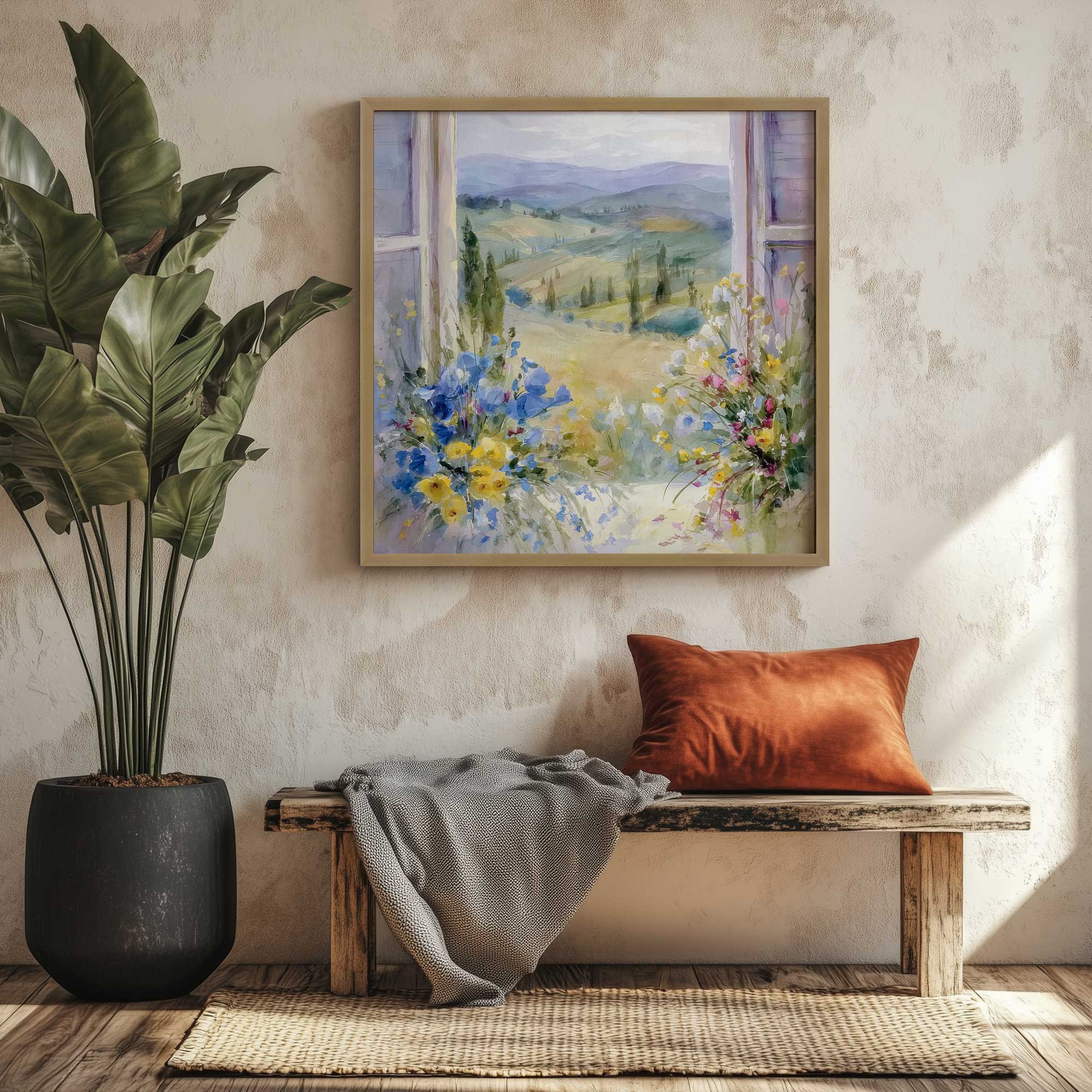
Use Mats and Negative Space Strategically
Negative space is what allows artwork to breathe. Without it, even great pieces can feel cramped or unfinished. Adding a mat or choosing artwork with built in space around the subject creates a sense of importance and refinement. This is a subtle upgrade that instantly makes art feel more elevated.
- Use white or soft neutral mats to add breathing room around smaller artwork
- Increase mat width for a more high end, gallery style presentation
- Pair minimal artwork with generous negative space for a clean, modern look
- Keep mat colors consistent across a gallery wall for cohesion
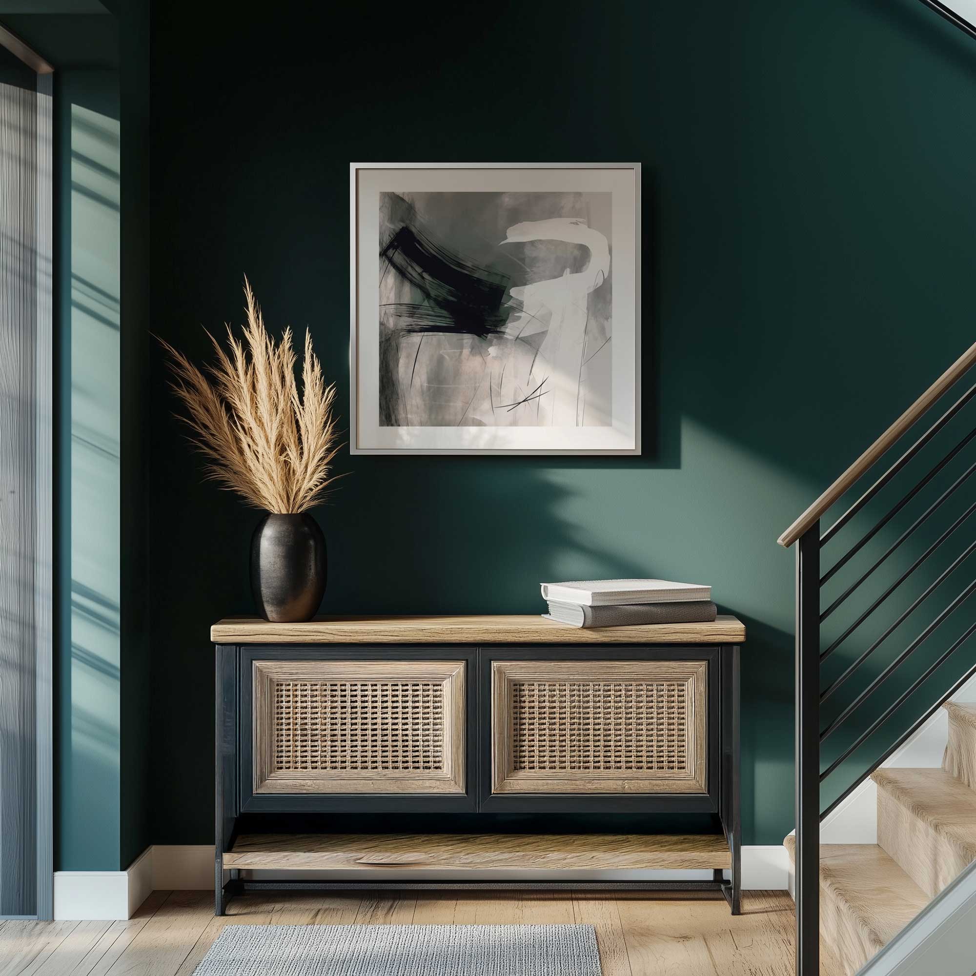
Align with Furniture and Architectural Lines
Professional looking spaces feel aligned and intentional. When art is slightly off center or not in line with nearby elements, it creates visual tension. Aligning artwork with furniture edges, shelves, or architectural features brings order to the space. This creates that clean, designer finished look.
- Center artwork with the furniture beneath it, not the wall itself
- Line up tops or bottoms of frames with nearby shelves or moldings
- Use vertical alignment to connect stacked pieces or narrow wall spaces
- Keep symmetry in mind when placing art in more traditional rooms
Style Your Walls Like a Designer
Making your wall art look more professional doesn’t require a full redesign, it comes down to small, thoughtful adjustments. When height, spacing, framing, and scale all work together, your walls start to feel curated rather than accidental. It’s these subtle details that quietly transform a space from good to truly polished. Happy decorating!