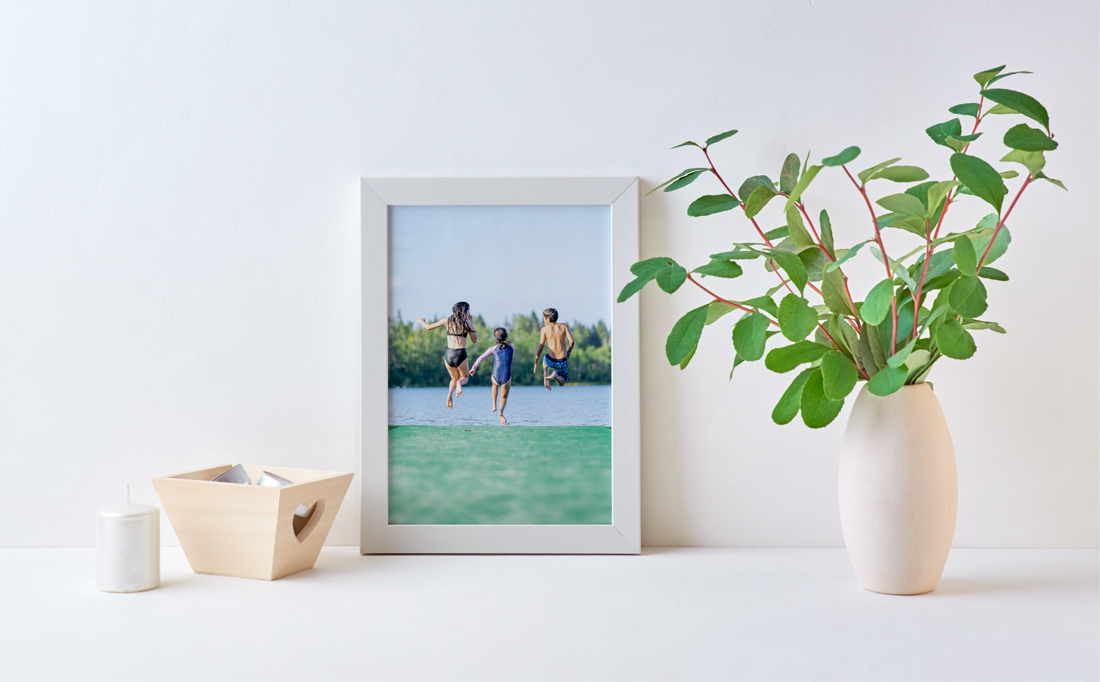
Tabletop picture frames are more than just functional: they’re an extension of your personal style. Whether you gravitate toward timeless elegance or love the bold energy of color, the right frame can enhance your treasured photos and artwork while blending seamlessly with your décor. The choice between a classic neutral frame and a vibrant, colorful one isn’t just about the picture inside, it’s about creating the perfect balance between your image, frame, and surroundings.
When to Choose Classic Tabletop Frames
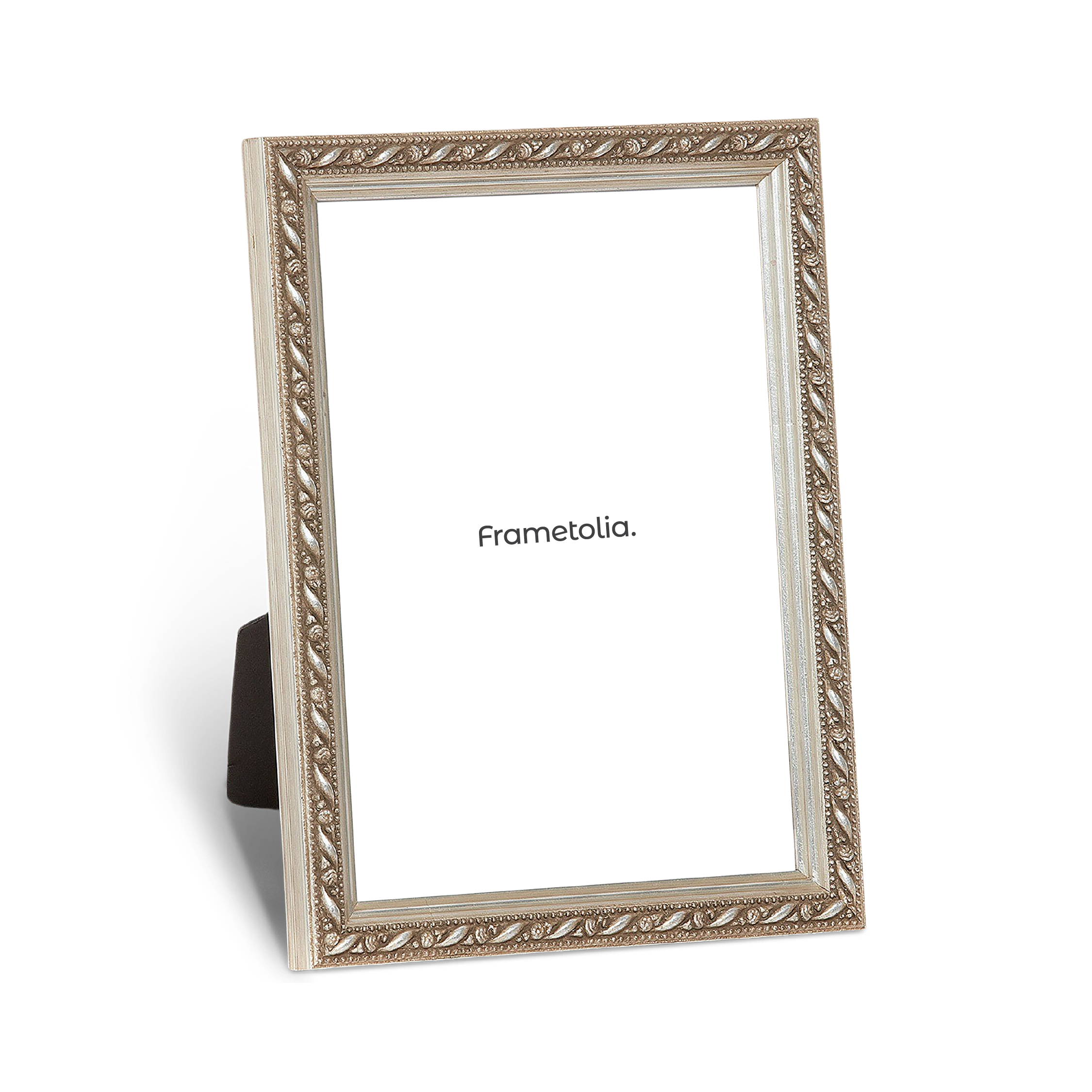
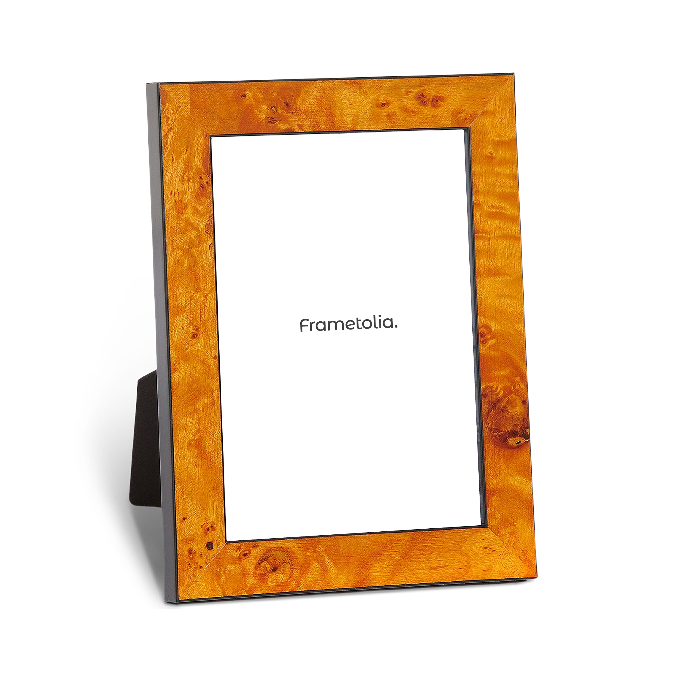
Classic tabletop frames, often in tones like black, white, silver, gold, or natural wood, have an enduring appeal. They let the image take center stage while offering a clean, sophisticated presentation that works in almost any room. These frames are particularly versatile for:
- Formal settings: Black or gold frames lend a refined, gallery-worthy finish to wedding photos, graduation portraits, and professional achievements.
- Coordinated collections: Matching neutral frames in various sizes can unify a tabletop display of family photos without overpowering the space.
- Timeless keepsakes: heirloom photos or black-and-white prints often feel most authentic in a frame with understated detailing and traditional finishes.
A well-chosen classic frame becomes a subtle backdrop, allowing the story in your photo to shine while blending seamlessly with both modern and traditional interiors.


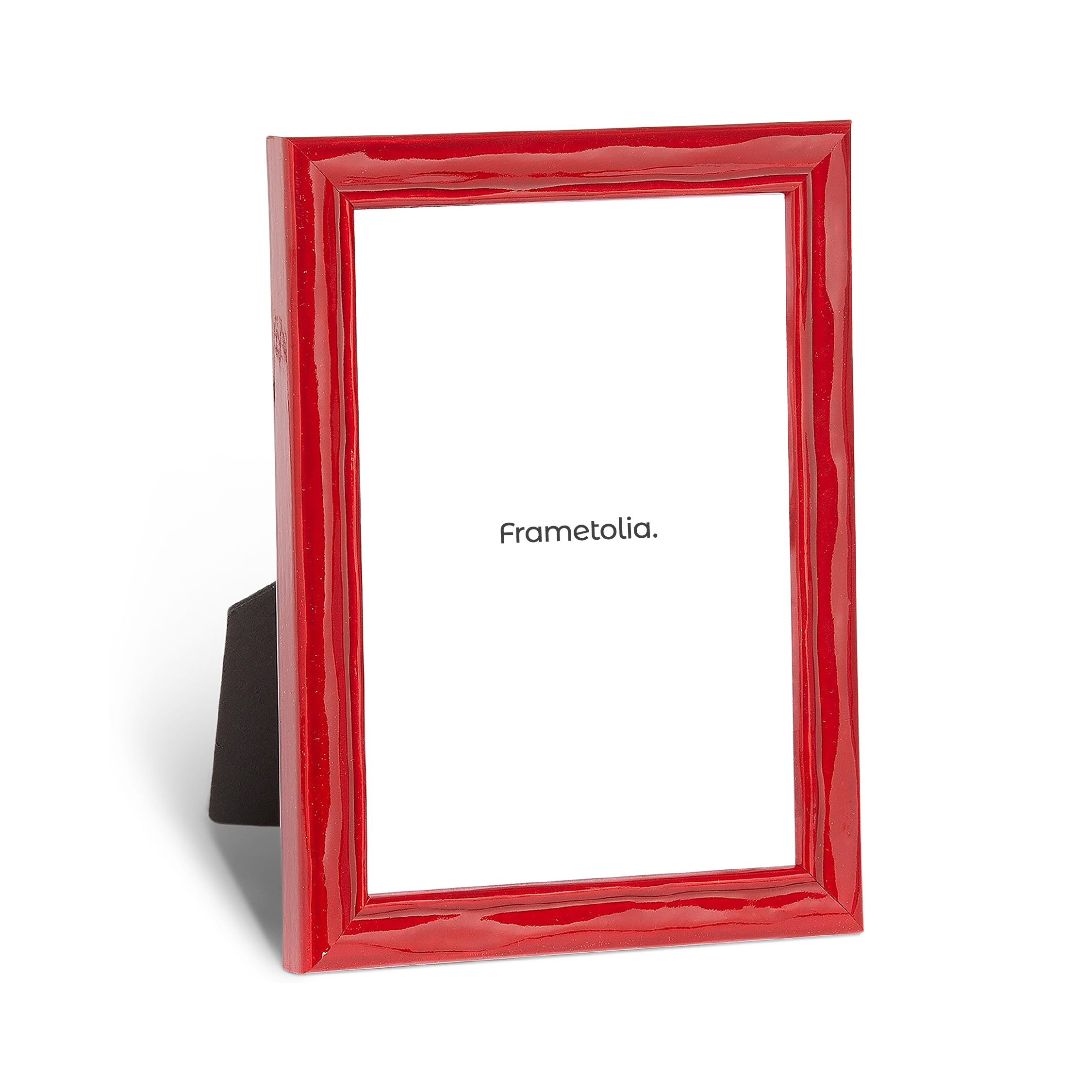
When to Choose Colorful Tabletop Frames
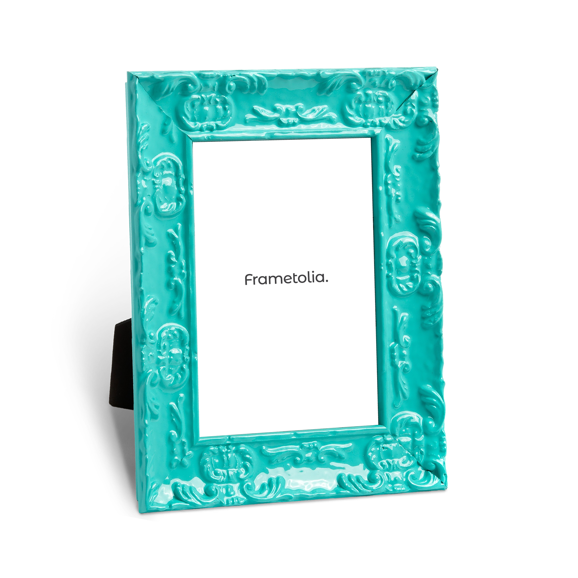
If your space thrives on personality, a colorful frame can be an instant mood-lifter. Vibrant hues—whether bold primaries or soft pastels—can highlight details in your image, echo accent colors in your décor, or create an eye-catching contrast. Colorful tabletop frames are ideal for:
- Adding a pop in neutral spaces: A turquoise frame on a white shelf or a coral frame on a wood console instantly draws the eye.
- Playful or themed rooms: Bright reds, yellows, or blues add whimsy to children’s bedrooms, home offices, or eclectic living spaces.
- Seasonal styling: Swap in warm jewel tones for autumn or fresh greens and yellows for spring to refresh your tabletop display.
The key with color is coordination and tying the shade of your frame to a tone within your photo or your existing décor ensures the look feels intentional, not accidental.
Finding Your Balance
The most engaging tabletop arrangements often mix classic and colorful frames for a look that feels curated yet personal. This approach lets you enjoy the timelessness of neutrals while introducing pops of personality. Try these tips:
- Anchor with classics: Use black, white, or natural wood frames as the base to give your display stability and cohesion.
- Add intentional accents: Introduce one or two colorful frames to create focal points without overwhelming the group.
- Play with placement: Cluster colorful frames toward the center for emphasis, or scatter them for a more relaxed feel.
- Vary scale and proportion: Combine small, brightly colored frames with larger neutral ones for balance and depth.
- Coordinate with your photos: Match frame colors to tones in the images to create a harmonious, intentional look.
Elevate Every Photo Your Way
At Frametolia, we believe tabletop frames should be as unique as the memories they hold. Our high-quality wooden frames are handcrafted, sustainably sourced, and available in a wide range of timeless neutrals and curated colors. Whether you’re drawn to understated elegance or joyful vibrancy, our collection ensures your most meaningful images are framed in a way that complements your style and your home. For more inspiration check out our table top picture frames. Happy decorating!